
Brave New World Book Covers
Book cover designs provide a modern aesthetic for a modern classic.
Friendly Giant Publishing, located in Santa Monica, is looking to release new cover designs for Brave New World as part of a series. Friendly Giant’s hope is to reinvigorate the interest in the book for its 85th Anniversary in 2017.
The new designs must reflect the book’s meaningful message and single-minded value proposition, as well as act as an intriguing marketing tool to sell copies. Stylistically, Friendly Giant is looking for uniqueness among the designs to relate to a variety of target readers, and to reflect different characteristics of the novel.
Skills
Digital Illustration
Typography
Information Design
Deliverables
Book Cover Design
Concept 1: Dehumanized Society
concept
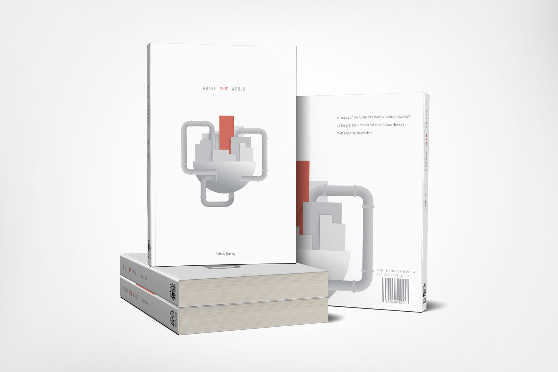
Brave New World is set in a future that is much different from the modern society of today.The first design theme captures the dehumanized nature of the dystopian setting of the novel. It draws on the feelings of loss of hope for humanity and isolation that the main character feels in his discovery of the society he lives in.
Skills
The book cover visually represents the dehumanization of society with visual metaphor and symbolism. The austere city rests alone in a void of surrounding space, evoking a sense of isolation and distance. Pipes emerge from the city, curve to reflect the arteries of a human heart. The juxtaposition of the industrial nature of the pipes and the shape they reflect symbolizes a loss of humanity. One building rests amongst the others but is singled out in color and size. This building represents the main character, who, in the novel, is a metaphor for the single mind against all others. Like the main character, though the building is differentiated from the others, in the end it still acts as a cog in the machine.
aesthetics
Each aesthetic decision was made to further portray the theme of dehumanization. The buildings are illustrated using rigid geometric shapes that lack the warmth and humanistic quality of curved shapes. The monochromatic grey color palette gives the reflects bleak, cold industrialization. Small, technical typography evokes strict functionality. The splashes of red color in the title and building are meant to contrast the sterile color palette and draw attention to the further meaning of their content. The grainy filter is used to reflect distortion and removal from reality.

Concept 2: From the Horse's Mouth
concept
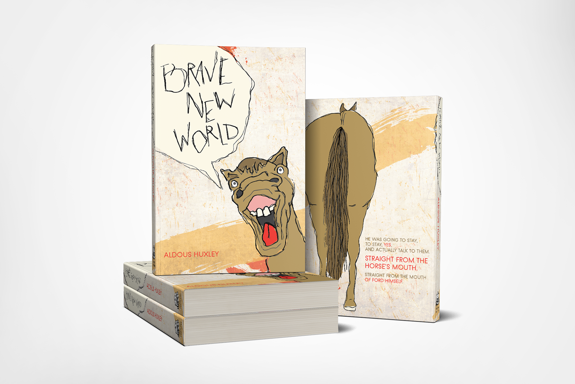
The second design theme captures the often odd, unsettling characteristics of the novel using a visual representation of statements that appear in the text. Throughout the novel, the line “Straight from the horse’s mouth” is repeated whenever the Director speaks, to convey that he is an authoritative figure. The design draws on this element of the text, but conveys it in an unsettling, satirical way, removing the credibility and authority of the “all-knowing” preaching Director, and making a pointed statement about following blind ideologies.
solution
The book cover’s main graphic is a grotesque, illustrated horse with its mouth open. From his mouth is a speech bubble which holds the title of the book. His rear end appears on the back along with the “Straight from the horse’s mouth” quote from the book, pointing out in jest where the Director’s philosophies might actually be coming from.
aesthetics
The aesthetic decisions that were made for the design of this book jacket are intended to evoke uneasiness, and expose an element of unsettling insanity. The illustration style used for the horse and speech bubble has ragged, layered lines to portray an apparent lack of control and give viewers a sense that something is not quite right. The horse itself has bulging eyes and a grotesque open mouth, which is unusual and unnatural. The bright color palette, with splashes of yellow and red, evokes a sense of excitability and heightened emotion.