LPA Design Studios Brand Revitalization
Breathing new life into the visual identity of an established, integrated architecture firm.
LPA is a 54-year-old integrated architecture firm that serves clients in the K-12, Higher Education, Civic, Mixed-Use, Sport and Recreation, and Healthcare markets. Though successful, with the majority of their work coming from repeat clients, LPA lacked a strong visual identity and brand consistency in their marketing materials. LPA sought a contemporary brand mark that retains LPA’s recognizability as an established brand, defined standards for consistent brand equity across all touchpoints, and a suite of redesigned materials.
The Challenge:
How can we create a contemporary, yet recognizable brand identity to help LPA become a national firm?
Skills
Brand Audit & Strategy
Logo Design
Graphic Design
Deliverables
Brand Identity
Internal & External Marketing
Website Redesign

A New, But Recognizable Brand Mark
A new brand mark is the first step to helping LPA achieve a powerful, meaningful, and engaging brand. The new mark positions LPA as a contemporary and forward-thinking design firm, helping to market high quality design services to attract better projects that command higher fees.
Logo
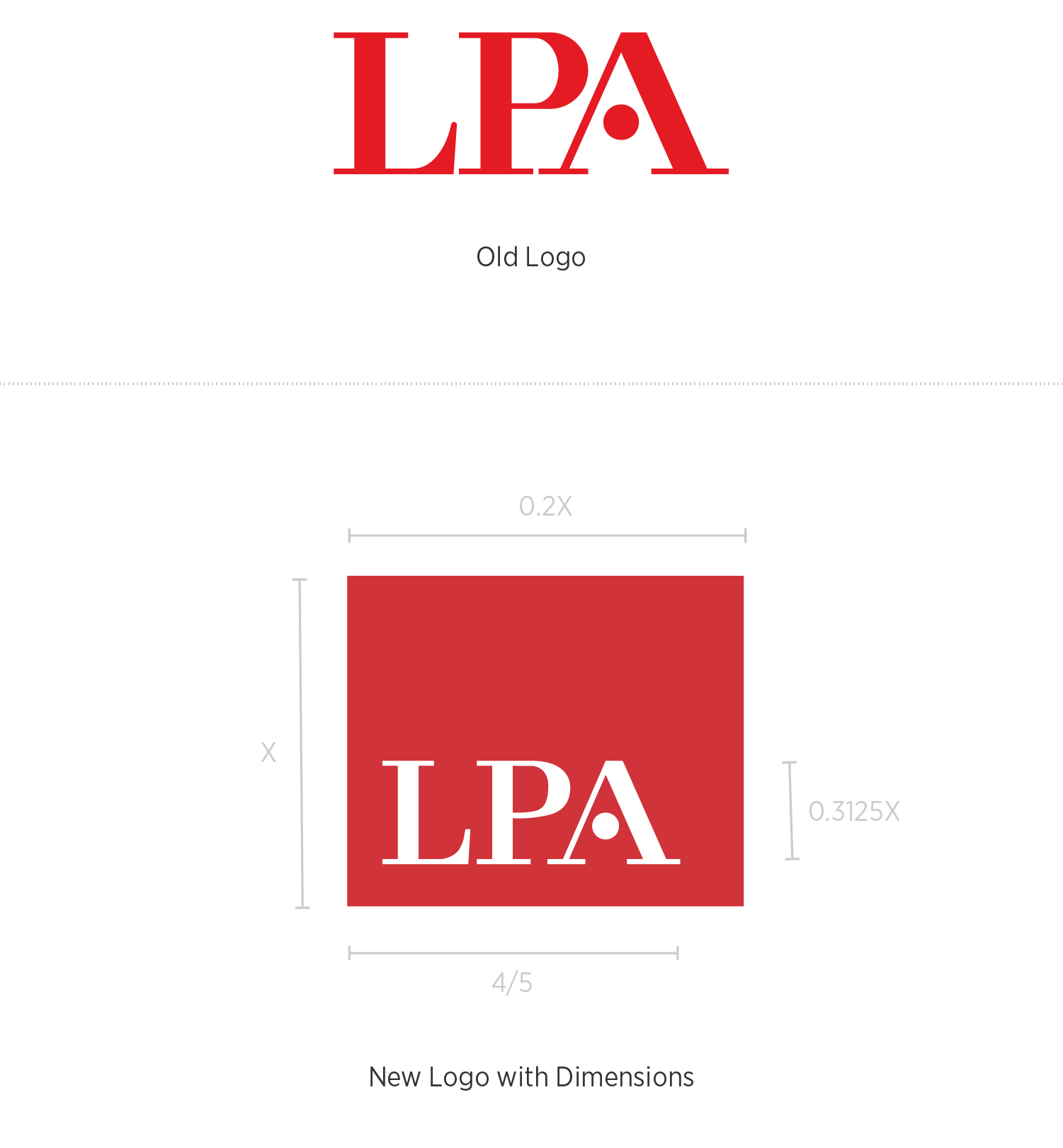
LPA’s new logo features modifications of the company’s original logotype, and introduces the “red box” to contain the mark and provide it with a more contemporary brand presence. Assigning a structured shape makes the logo more identifiable, improves recognition in the marketplace, and reflects the work of the Architecture industry. The simple, “no-frills” logo helps influences perception of quality and value for investment.
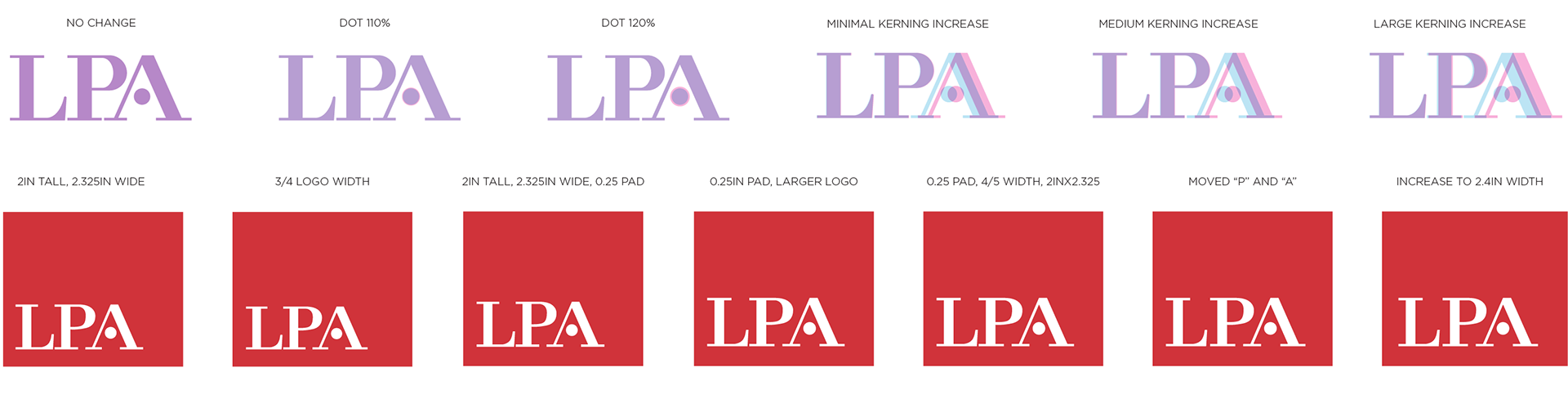
Logo Explorations
Modifications to the company’s original logotype included cleaning up the serifs and terminals, rounding them out and making them consistent; adjusting the kerning of letterforms for a more balanced mark; and adjusting the size of the dot within the counter of the “A” to be more proportional to the mark and fit comfortably within the white space surrounding it.
We also explored the size and placement of the letterforms within the new “red box,” and standardized their relative proportions to one another for the logo as a whole.
Building Out the Revitalized Brand Identity
The next step in LPA’s brand revitalization was to create a typography system and color palette that would appear consistently throughout branded marketing materials.
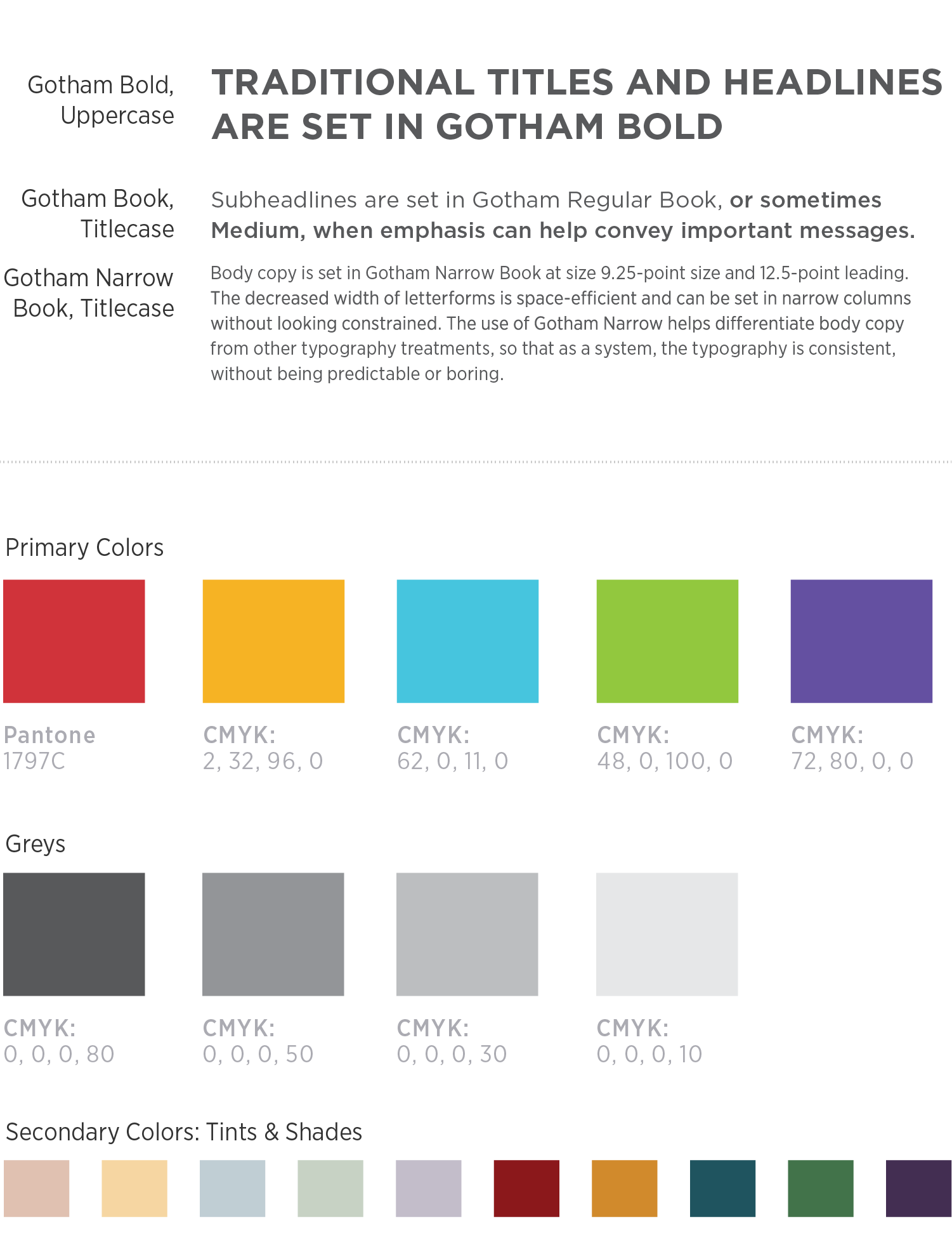
Typography
LPA’s new font families are Gotham and Gotham Narrow, geometric sans-serif fonts well-regarded for their legibility and diversity of styles and weights in each family. Gotham and Gotham narrow are rounded and friendly, yet command attention and regard.
Gotham was designated for use as headline or subheadline type. Gotham Narrow Book is LPA’s text-face, because of its efficient use of space and differentiation in width from Gotham.
Gotham’s letterforms are inspired by a form of architectural signage that achieved popularity in the middle of the 20th century in New York City. It’s architectural background made Gotham an excellent fit for LPA as an architectural company.
Color Palette
LPA previously used a variety of color builds for its red brand color, so our first task in tackling color was to standardize the red as Pantone 1797.
Next a suite of secondary colors were identified, including greytones and tints and shades of primary colors. The resulting palette is diverse and consistent, for a wide range of uses.
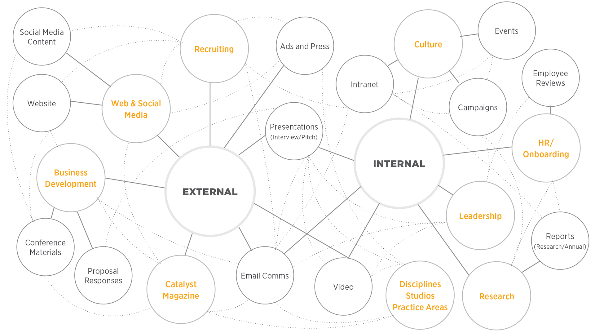
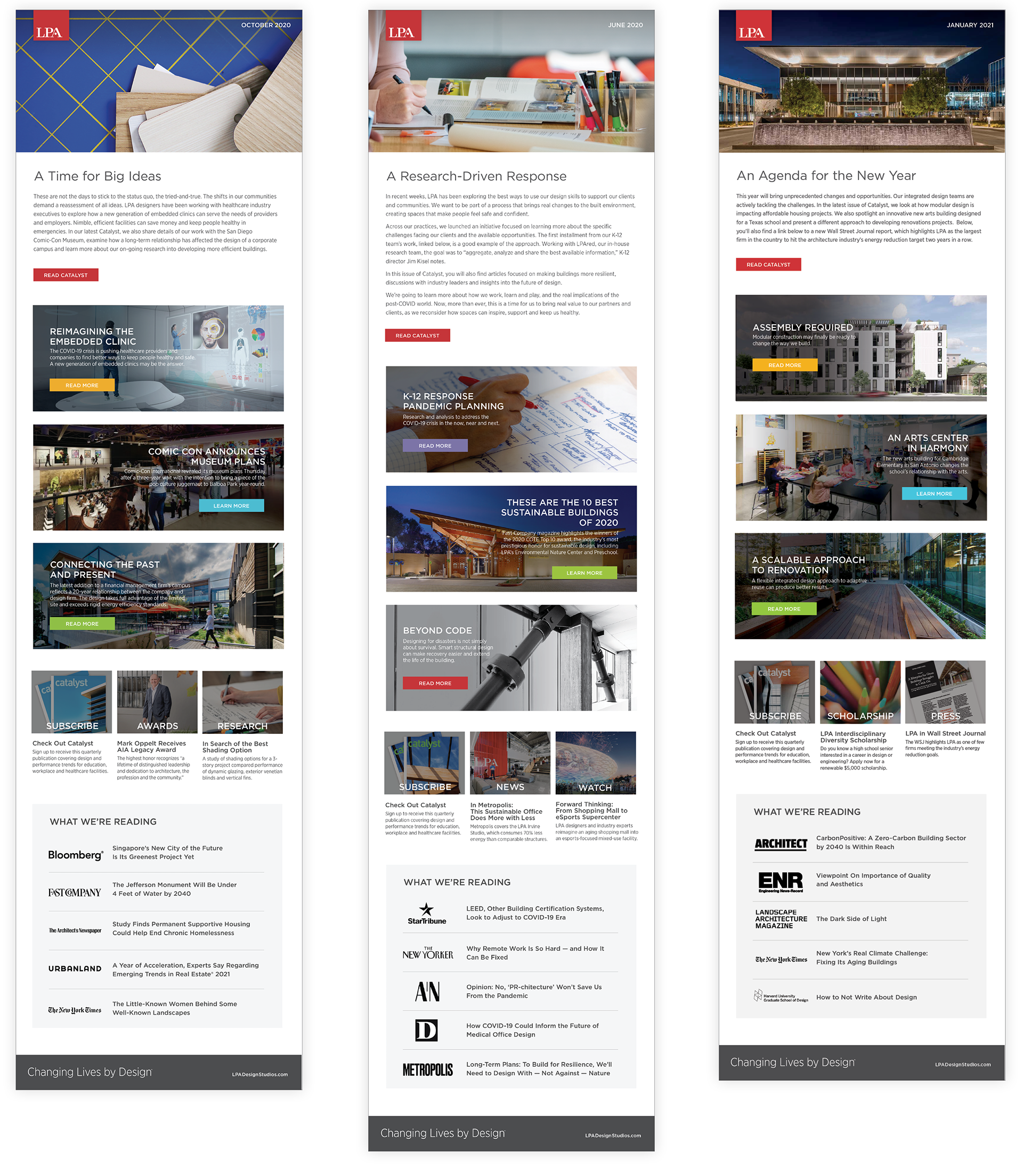
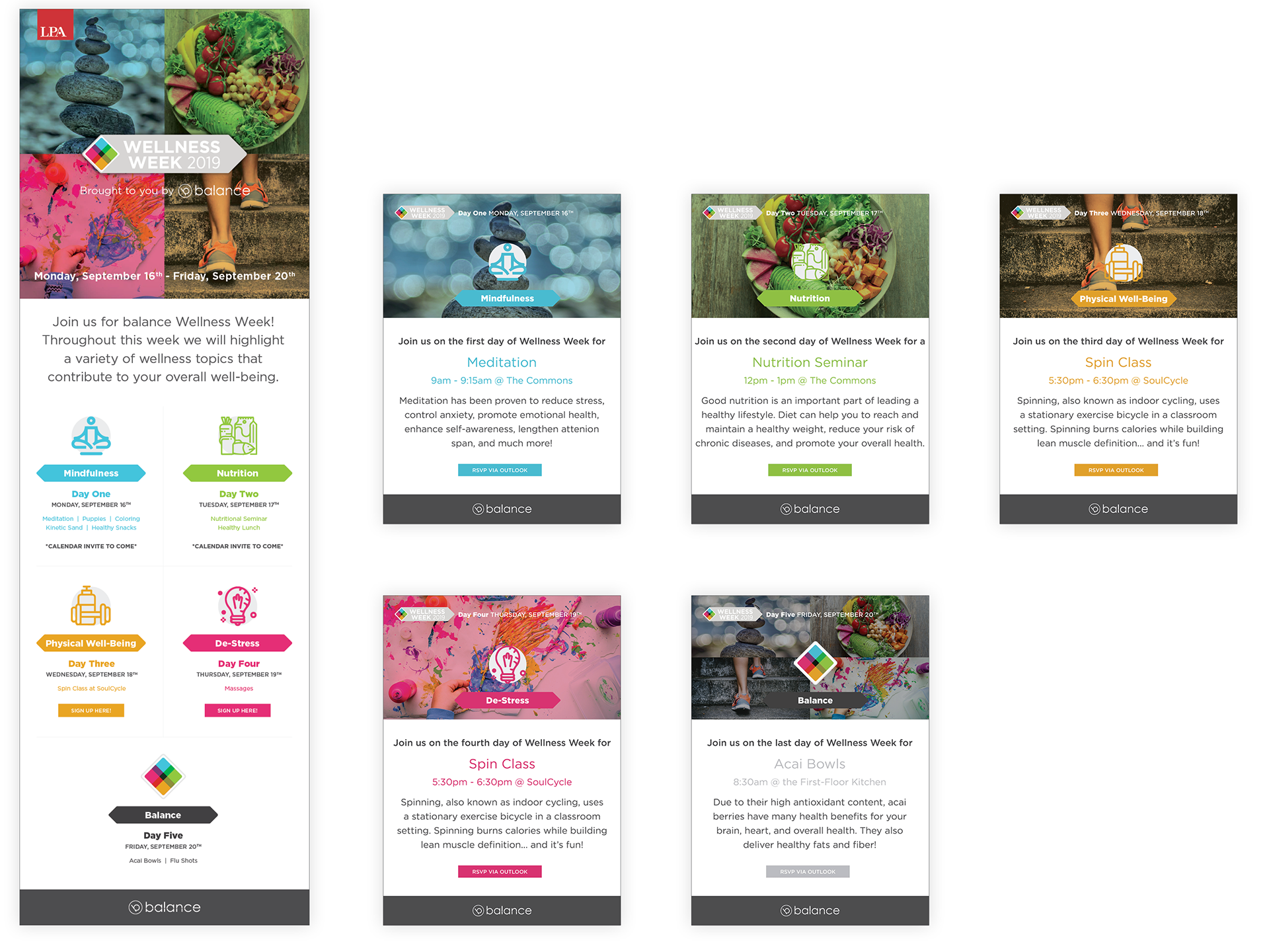
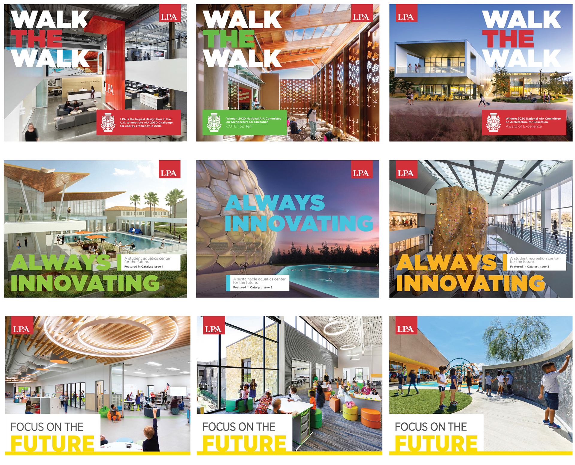
An Ecosystem of Branded Materials
Monthly Email Newsletters
Internal Campaigns (shown: Wellness Week 2019)
Social Media Campaigns
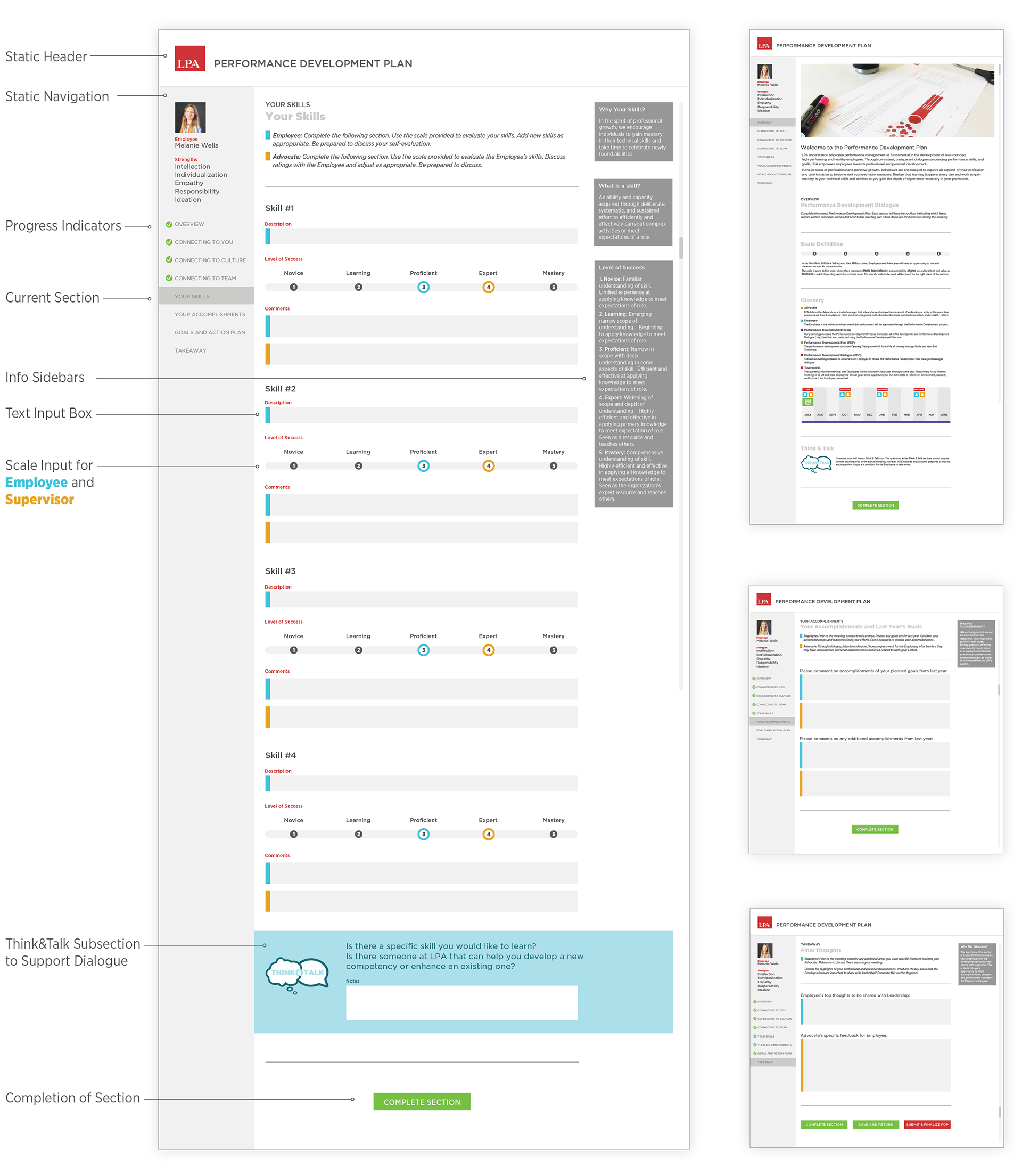
Performance Development Application