Nexus Environmental Graphics
Activating a dated corporate campus with a new identity and improved user experience.
Transwestern, a development company located in Texas, was sought the services of an integrated design team for extensive interior and exterior improvements to the former American Airlines campus. The multi-disciplinary LPA design team developed a brand identity, wayfinding system, and environmental graphics that work together to provide a sense of place to the corporate campus for tenants and visitors alike.
The Challenge:
How can we create a usable, unique, and cohesive sense of identity and place throughout the corporate campus?
Skills
Environmental Graphic Design
Branding & Typography
Information Design
Brand Identity
Environmental Graphics & Signage
Wayfinding System
Team
Melanie Wells: Environmental Graphics & Wayfinding
Jack Li: Architectural Design
Rick D'Amato: Interior Design
Rich Bienvenu: Landscape Architecture
Background
Site
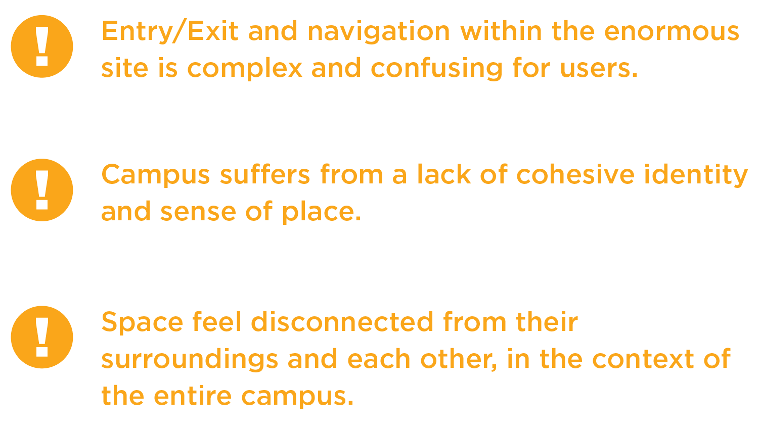
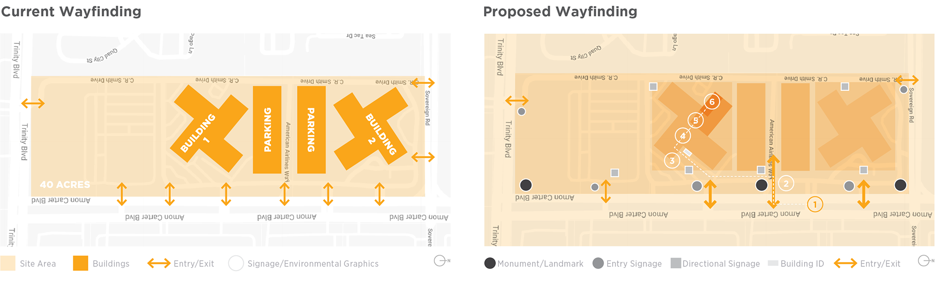
The corporate campus is located a few miles from the Dallas Fort-Worth airport and was previously the American Airlines headquarters. The site itself is enormous, taking up 4 blocks at 40 acres, and hosting two 600,000-square-foot buildings separated by a parking structure that services both.
Due to the size of the site and the separating parking structure, the buildings feel very isolated from one another, despite being a part of the same campus. Due to the large number of entries and exits to the site, minimal signage, and confusing navigation paths, the spaces are currently disjointed and frustrating to navigate.
Wayfinding
Historically the campus hosted a single tenant, however, Transwestern plans to lease white-box space to multiple tenants from a variety of industries. They are looking for branding to provide the campus with an overall identity, and branding and graphics that carry throughout the spaces to connect and unite them.
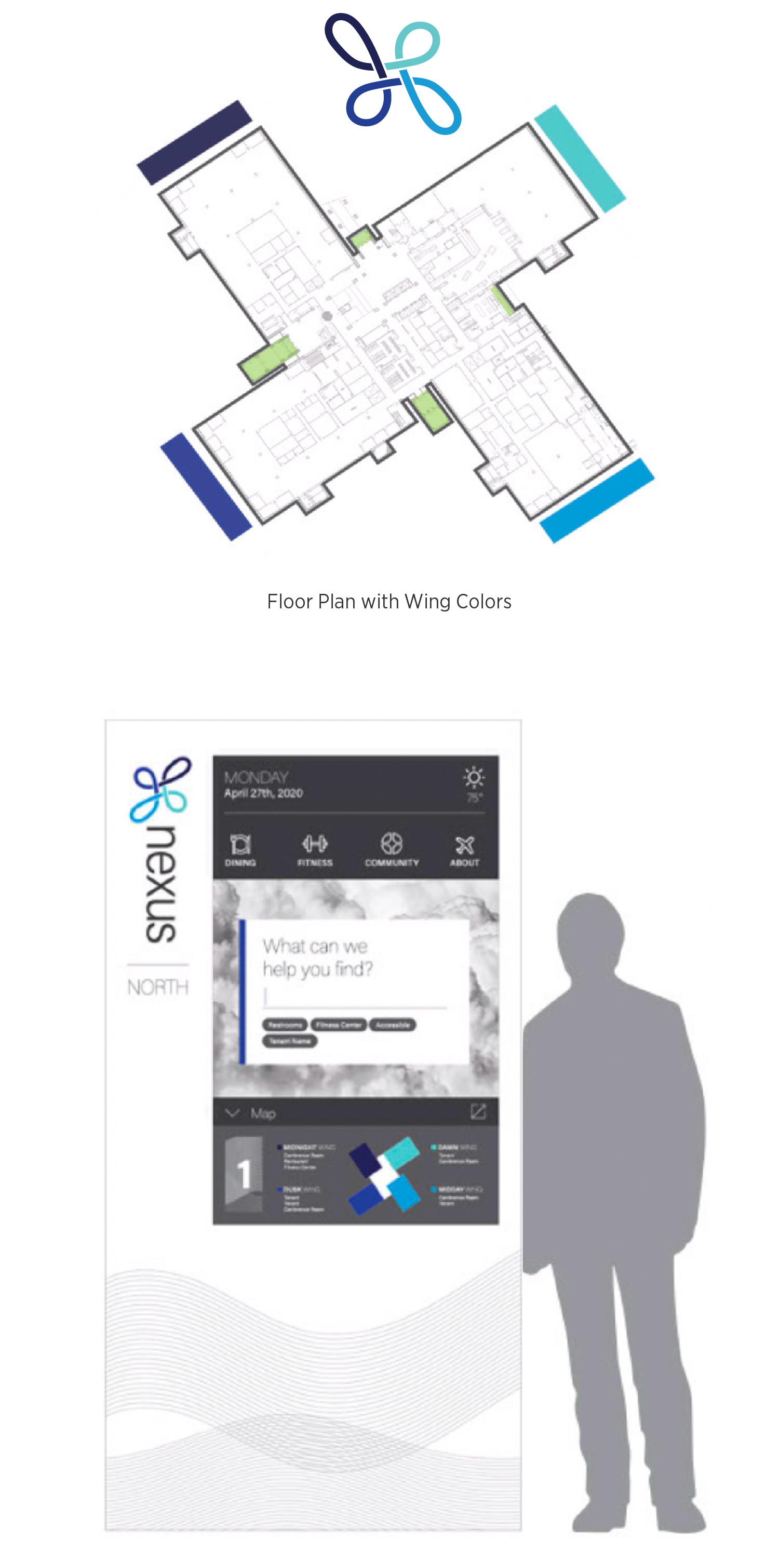
Wayfinding System
Site
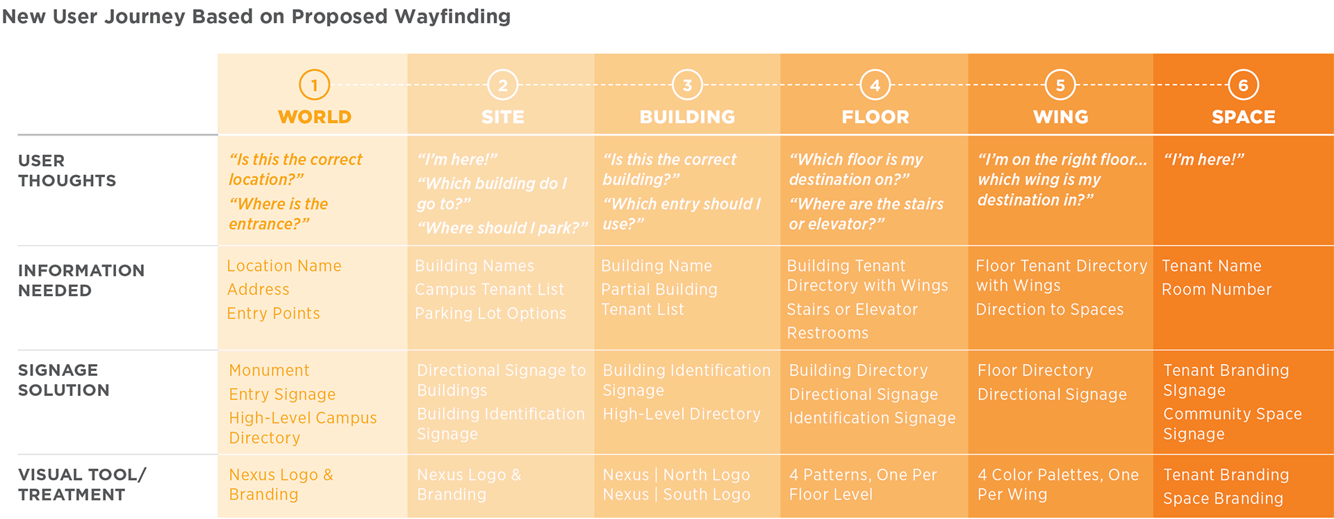
The new wayfinding system simplifies the complex and confusing existing navigation. The system’s framework utilizes a hierarchy of information based on the user’s journey. Users are provided with increasing detail in each consecutive stage of their journey.
Modified Site Map
Based on the wayfinding exploration, the team reduced the number of entry/exit points and increased the number of signage touchpoints throughout the navigational experience.
Brand Identity
Due to the campus’ proximity to the Dallas Fort-Worth airport and its previous life as the American Airlines headquarters, the brand identity is steeped in references of aeronautics and flight.
The brand name, Nexus, by dictionary definition, means “a connection, or connections, linking two or more things.” Like its definition, Nexus the corporate campus provides places for tenants and visitors to connect and collaborate, linking multi-disciplinary professionals across a variety of industries. The brand identity itself connects each of the digital and physical touchpoints throughout the campus, a consistent visual aesthetic that establishes a sense of community and place.
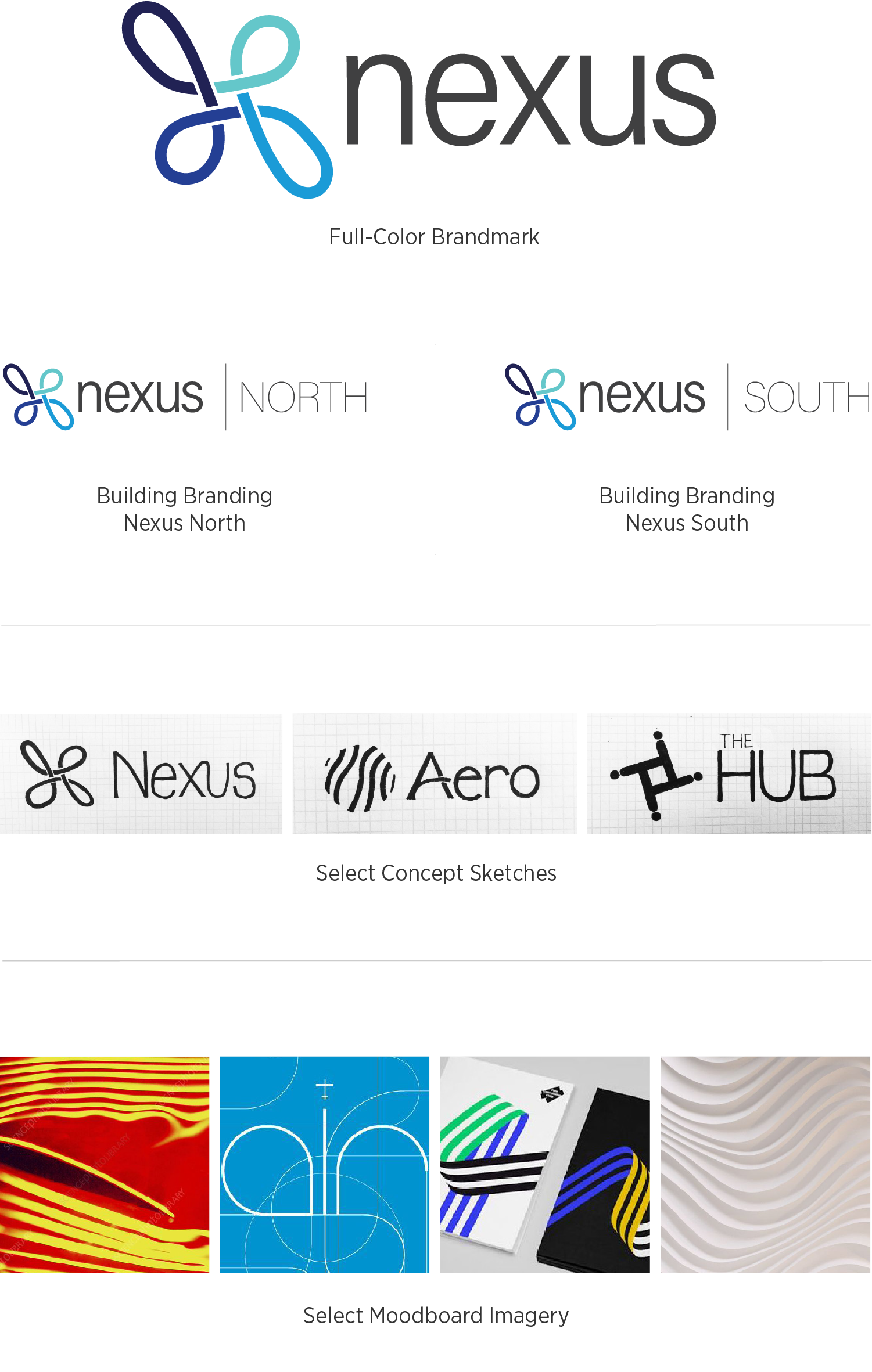
Logo
The logo features a customized logotype built from the thin, contemporary sans-serif font. The new brandmark derives its shape from the buildings’ footprint, which, whether originally intentional or not, resemble the propellers of an airplane. This unique characteristic is modified so that the shape is created by a single, organic line.
Color Palette
Inspired by the theme of flight and aeronautics, each of the four colors reflect those found in the sky at key phases of the day - dawn, day, twilight, and midnight. These colors correspond to the color-coding of the wayfinding system, connecting the brand identity to the physical space.
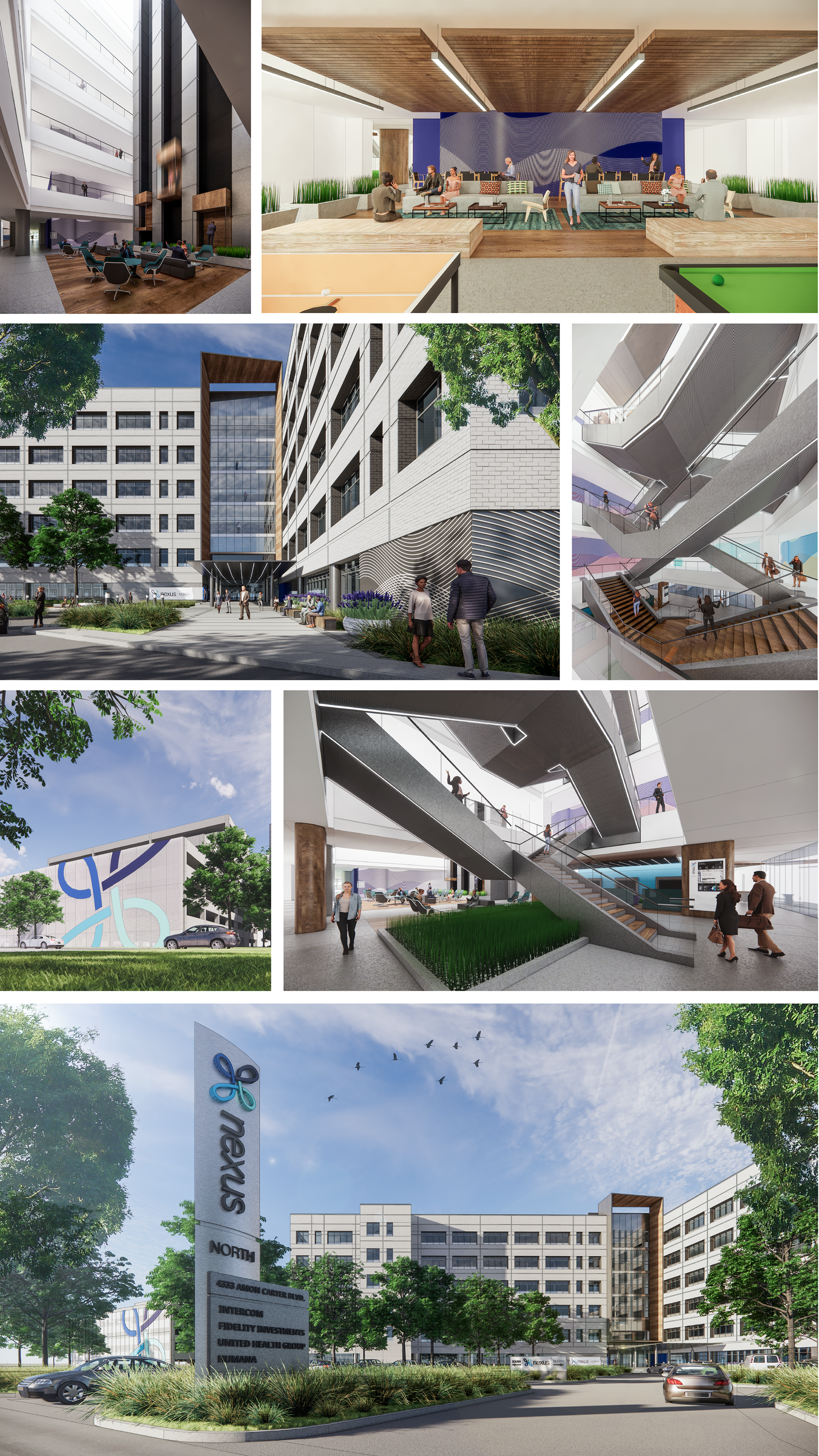
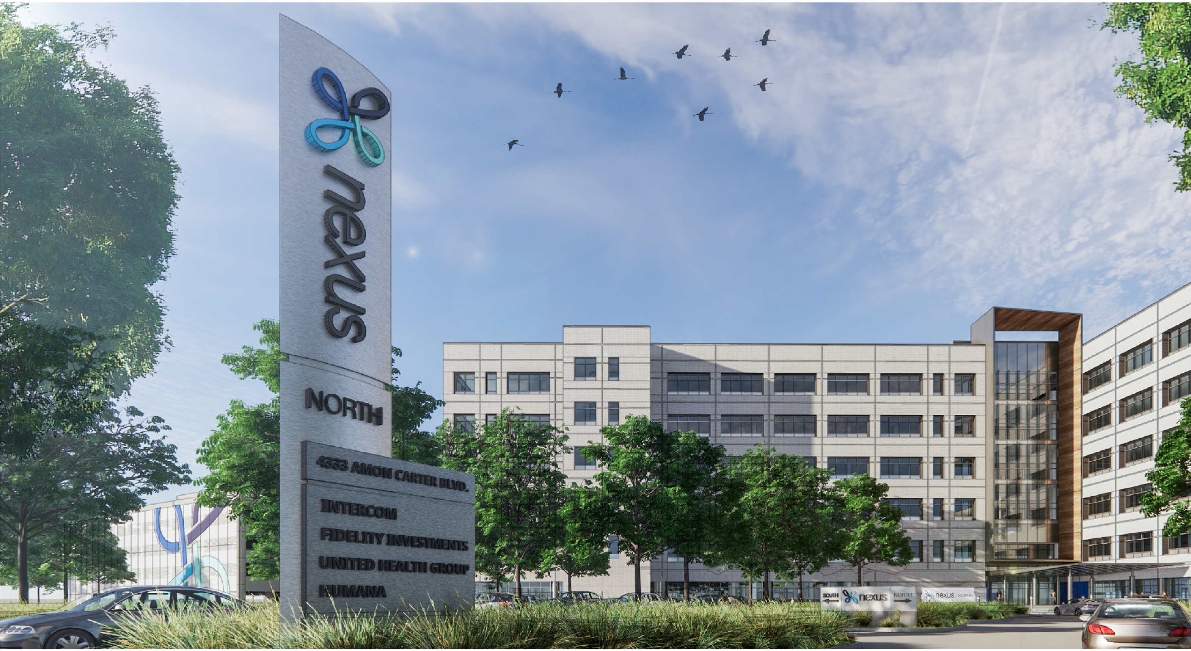
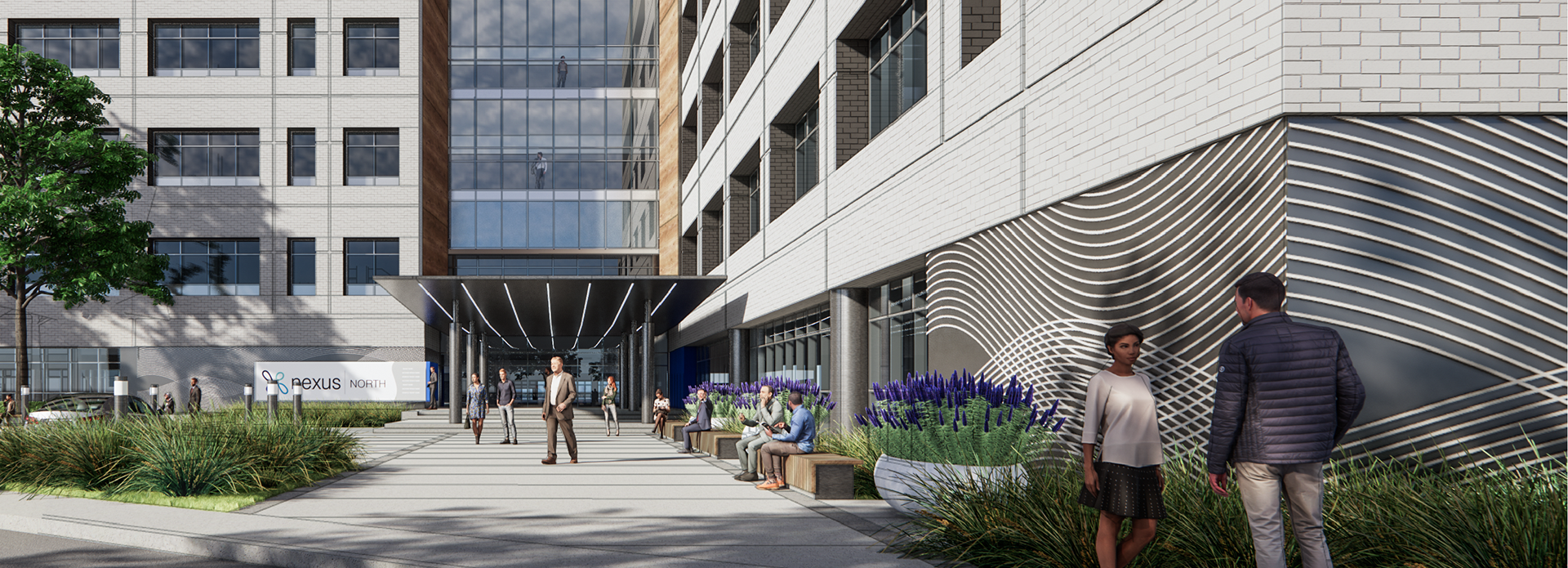
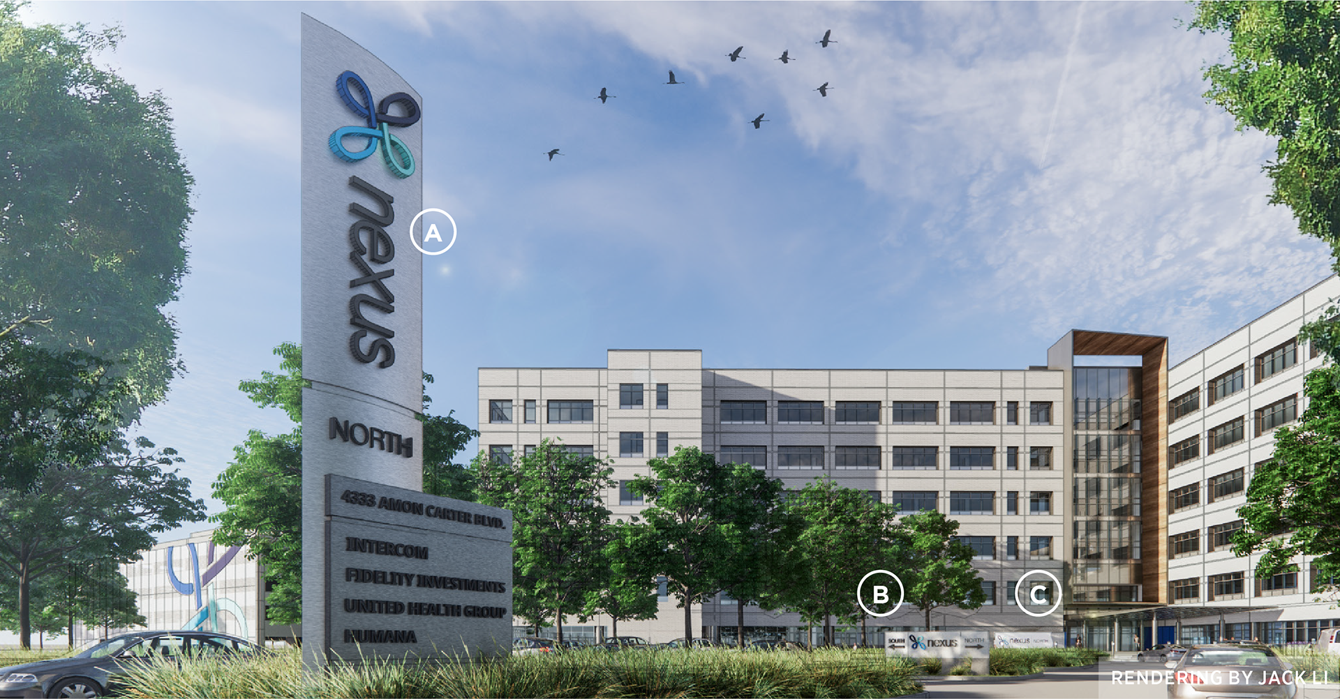
Exterior Environmental Graphics & Signage
The exterior environmental graphics and signage extend the visual elements of the brand identity and apply them to the established wayfinding system, unifying the campus both visually and functionally.
Visual Treatment
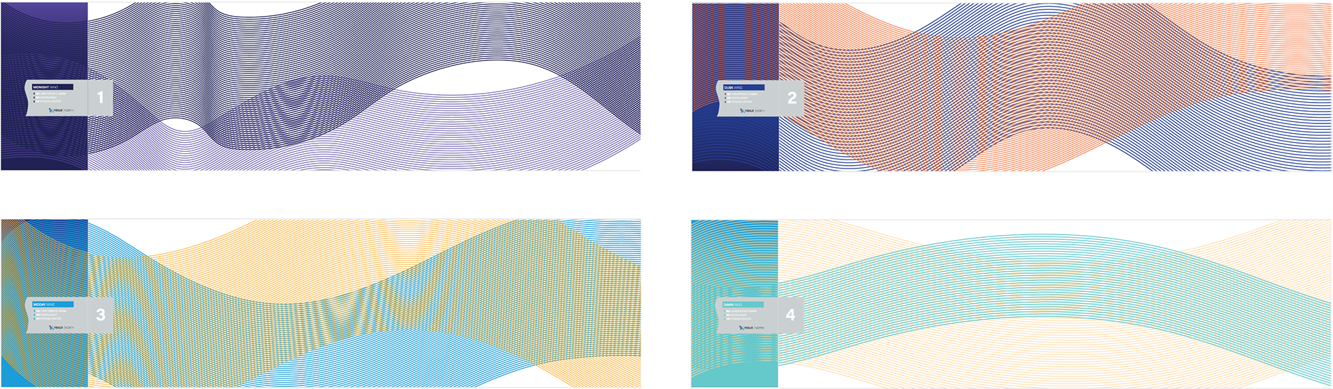
In line with the aeronautic background and concept of Nexus, environmental graphics feature a pattern that reflects airflow patterns that occur during flight. A single pattern is applied in the Nexus branded grey for external environmental graphics and site signage. Building entry signage appears at each wing’s entrance, and each is color-coded.

Interior Environmental Graphics & Signage
The interior environmental graphics and signage extend the visual elements of the brand identity and apply them to the established wayfinding system, unifying the campus both visually and functionally.
Color Differentiates Building Wings
A color-coding system was established to differentiate each wing of the building. As an extension of the theme of flight and aeronautics, each of the four colors reflect those found in the sky at key phases of the day - dawn, day, twilight, and midnight. These colors correspond to the 4 colors within the logo, connecting the brand identity to the physical space.
Pattern Differentiates Building Floors
Each floor of the building features a different pattern, each reflecting wind patterns, from calm to turbulent. A generic pattern is applied for general branding and site navigation, when not relating to a floor.
Digital Design Directory
In addition to providing navigational information, the digital design directory allows tenants and visitors access to explore all of the amenities and events that the Nexus campus provides.
Gallery