
DraftKings Product Design
I had the opportunity to work on the Product Design team to deliver many meaningful experiences to users such as the Marketplace Education Hub, a cross-vertical onboarding experience, and the Franchise Score functionality for the ReignMakers product.
As a Product Designer, I was responsible for end-to-end design of features and conceptualization of new features and experiences. I collaborated with Product Leadership, Brand & Visual Design, UX Research, Engineering and QA teams to concept, refine and ship these features.
Projects Included
Marketplace Education Hub See Project Page ↗
Cross-Vertical (DFS, SB, MP, Casino) Onboarding Experience 🚧 Coming Soon! 🚧
ReignMakers Franchise Score 🚧 Coming Soon! 🚧
Role
Product (UI/UX) Design Intern
Timeline
June - August 2022
Deliverables
Web User Experience
Native App Experience
Competitive Research
Product Design Brief
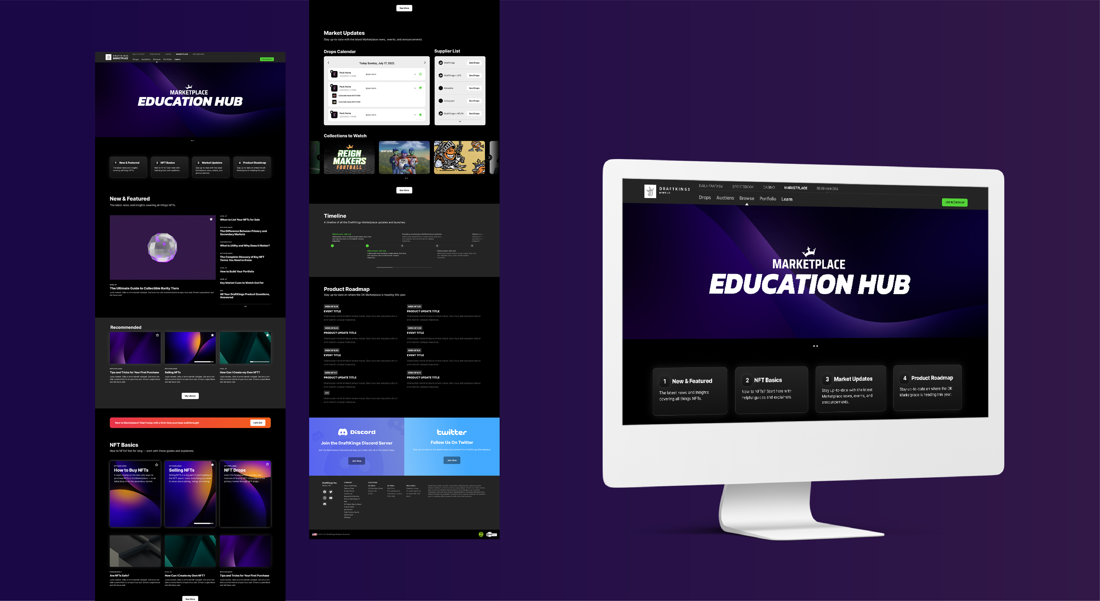
Marketplace Education Hub
A centralized hub for users to learn foundational NFT marketplace knowledge, as well as access market updates, trends, tips, and tricks to make informed choices when buying and selling collectibles.
I came up with the initial concept, pitched it and secured buy-in within the Product Team and was responsible for the information architecture, UI layout, and interaction design of the entire web interface. I also designed new elements for Market Updates and personalized information which made the Education Hub feel like a relevant and customized space.

Background
New users need relevant information about NFT Marketplaces in order to make informed decisions when buying and selling NFTs.
An improved educational experience will increase user engagement by establishing a sense of competence, increase user loyalty to DK Marketplace by providing credible and relevant information, and decrease the amount of outsourced educational content.
Challenge
The current Learn page only provides foundational knowledge about NFTs suitable for “green users,” but lacks detailed, time-sensitive marketplace information for experienced users.
How might we increase user engagement in the NFT marketplace by establishing a sense of competence and confidence in the user to make informed decisions, leading to more buying/selling activity?
Current State Audit Exposed Pain Points, Opportunities, and Successes
I was responsible for conducting an audit of the current Marketplace education experience, for both native mobile app and desktop web.
I highlighted key pain points, successes and areas of opportunity in the current experience, for each stage in the user flow. A few key issues arose:
1. On mobile, navigation, buttons, and menus are clunky and use too much visual real estate.
2. Across mobile and web experiences, navigation is confusing and information lacks contextual cues, clear hierarchy, and relationships.
3. Overall, the content is very text-driven and lacks visual interest.
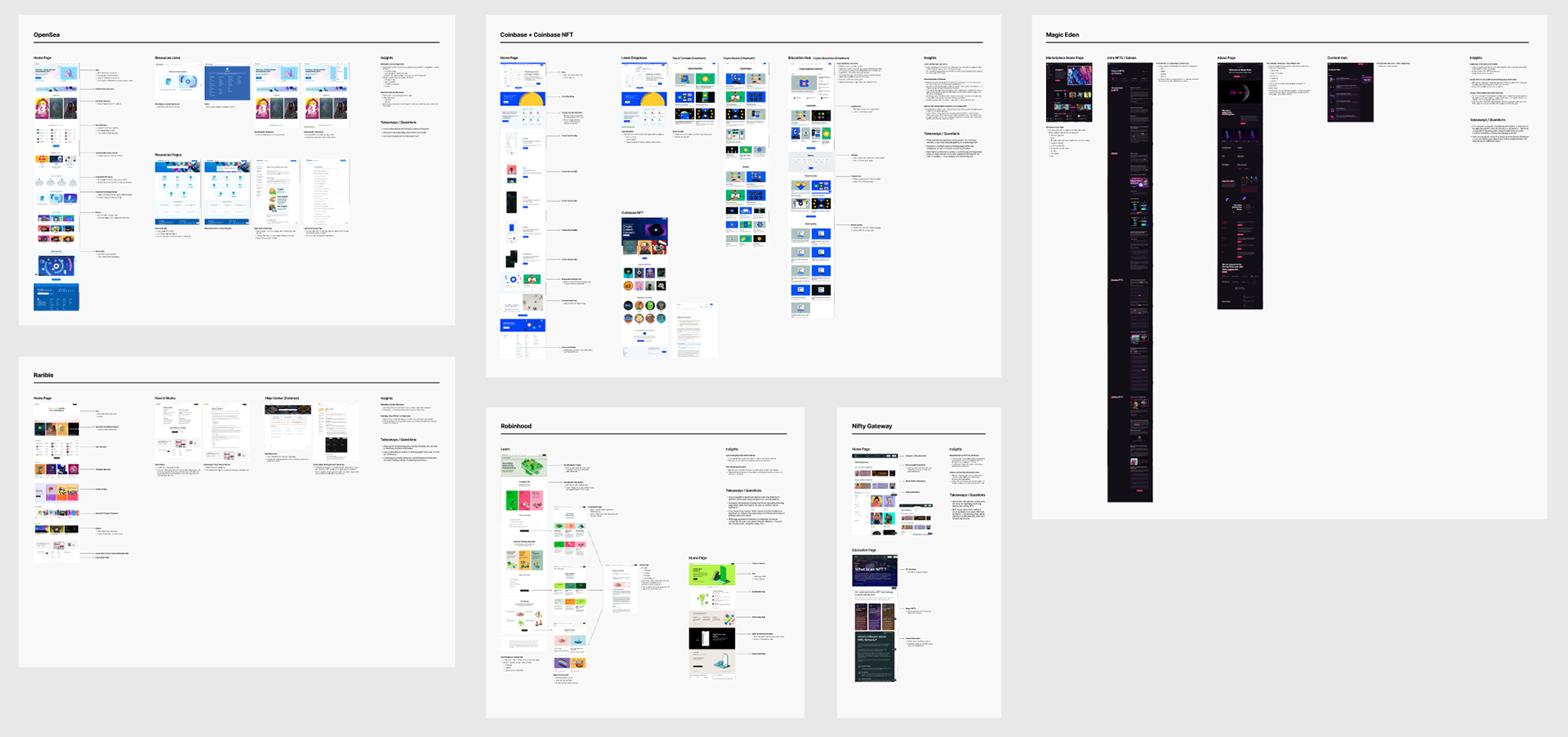
Competitive Analysis Highlighted Best Practices and Feature Improvements
Detailed competitive analysis of DraftKings' top Marketplace competitors led to these insights:
1. The most successful experiences presented educational information in a variety of mediums — banners, links, lists, carousels, etc.
2. There are pros and cons to using an external platform as the knowledge hub — information is kept in-reach but brand presence is diminished.
3. Successful experiences organized information intuitively, with references to its place in the overall context and hierarchy of information.
4. It is important to strike the right balance in the depth of detail of information provided, based on audience competency, goals, etc.
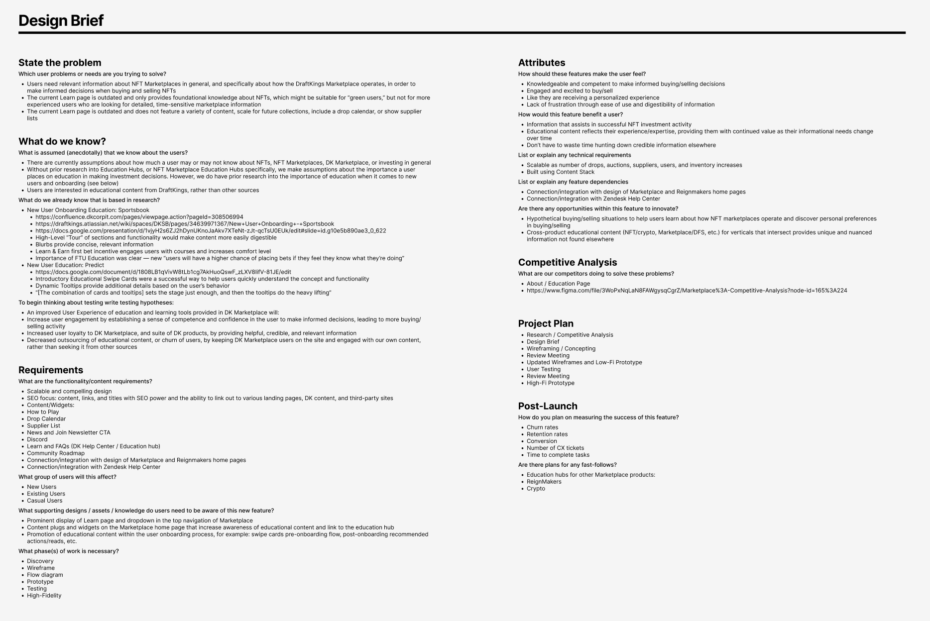
I Wrote the Design Brief to Serve as a "North Star" Through the Design Process
Based on the spec document I was provided by the Product Director, and with the findings of the audit and competitive analysis, I wrote the project's Design Brief.
The brief detailed Problem, Users (Anecdotal and Research), Functionality Requirements, Attributes, Competitive Analysis, Project Plan, Testing & Success Metrics
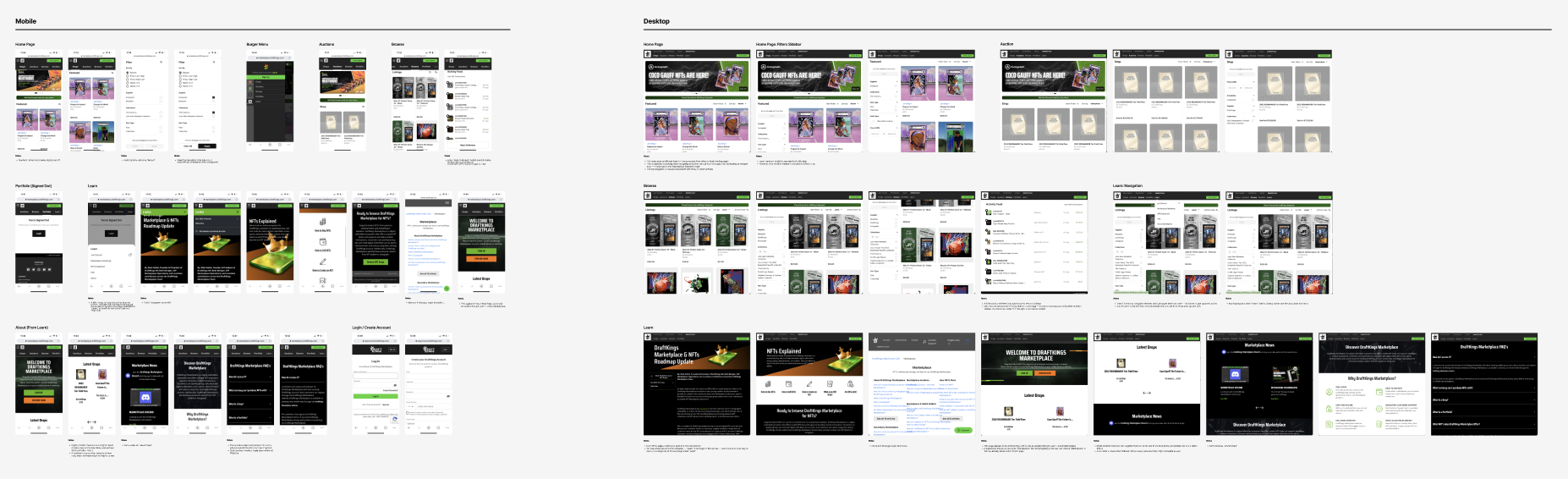
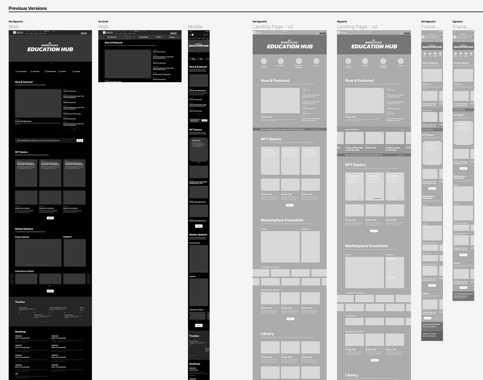
Exploring Layout Through Wireframes
After identifying core content requirements, I began developing wireframes to explore page layout.
From the earliest stages of the process, I designed for both the native app and desktop web, to be sure that the experience was seamless across devices.
Because personalization was identified as a key differentiator, early wireframes considered a flexible design to reflect feature/content changes based on whether a user is signed in or not.
Incorporating UI Design in Mid-Fidelity Mockups
I applied the specifications of the Marketplace design system for a sleek UI and built custom components for Drops Calendar and Supplier List.
Applying typographic and visual design nuances increased the level of detail and polish in mid-fidelity mockups. I created custom component designs, based on the product design system, to achieve a more detailed communication of market updates for users.
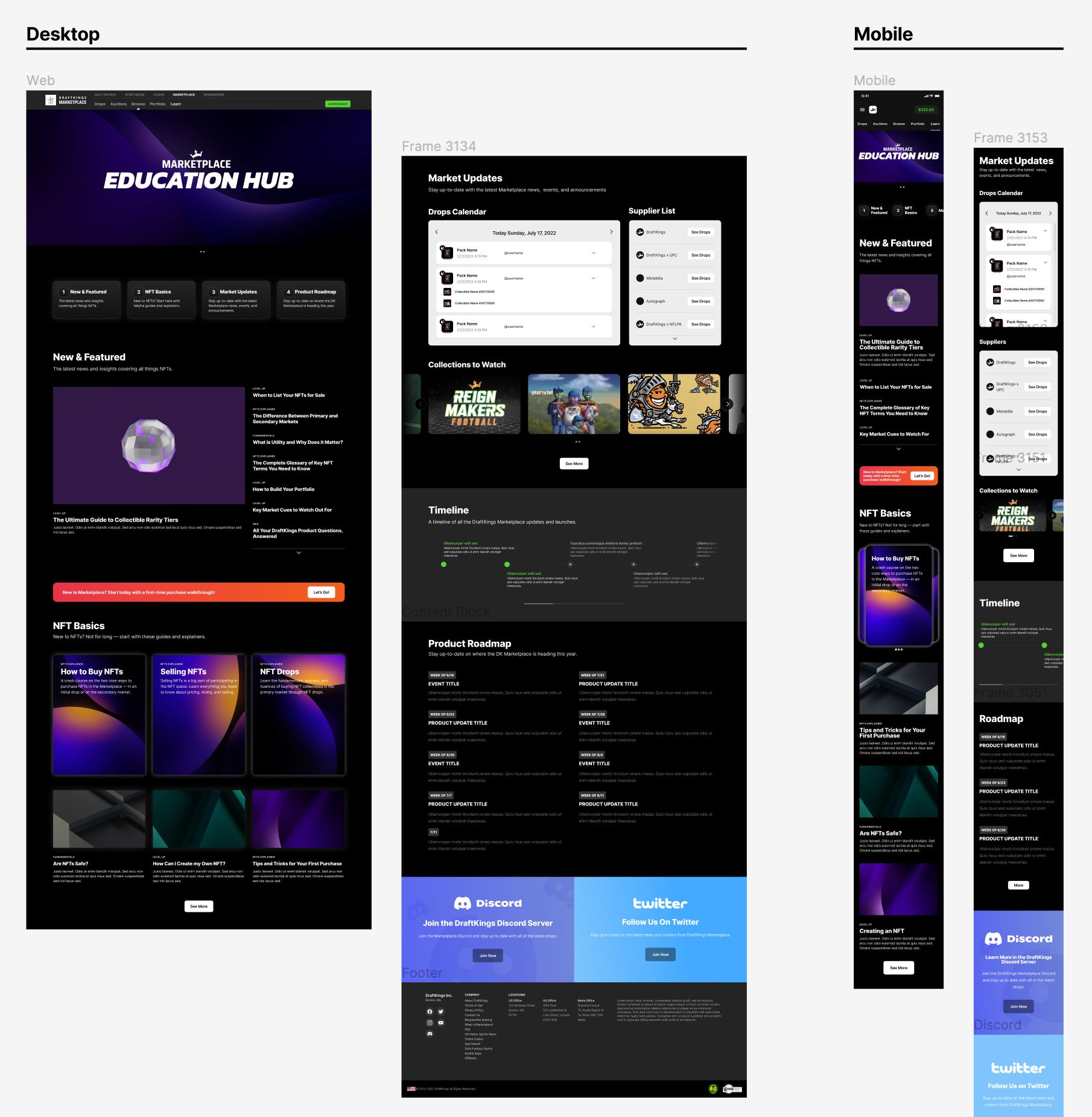
Creating Interactivity for High-Fidelity Prototypes
Next, I created micro-interactions and animation to bring the design to life in high-fidelity prototypes.
For both native app and desktop web, I built in horizontal scroll for content cards, varied visual states for interactive elements, expanding and collapsing menus, and graphic animations.
Design Pivot: Use of Pre-Existing Components
Due to new time and financial constraints of developers, the design could no longer include custom components.
In response to this new direction, I took account of the pre-existing component assets and applied them to translate the original design.
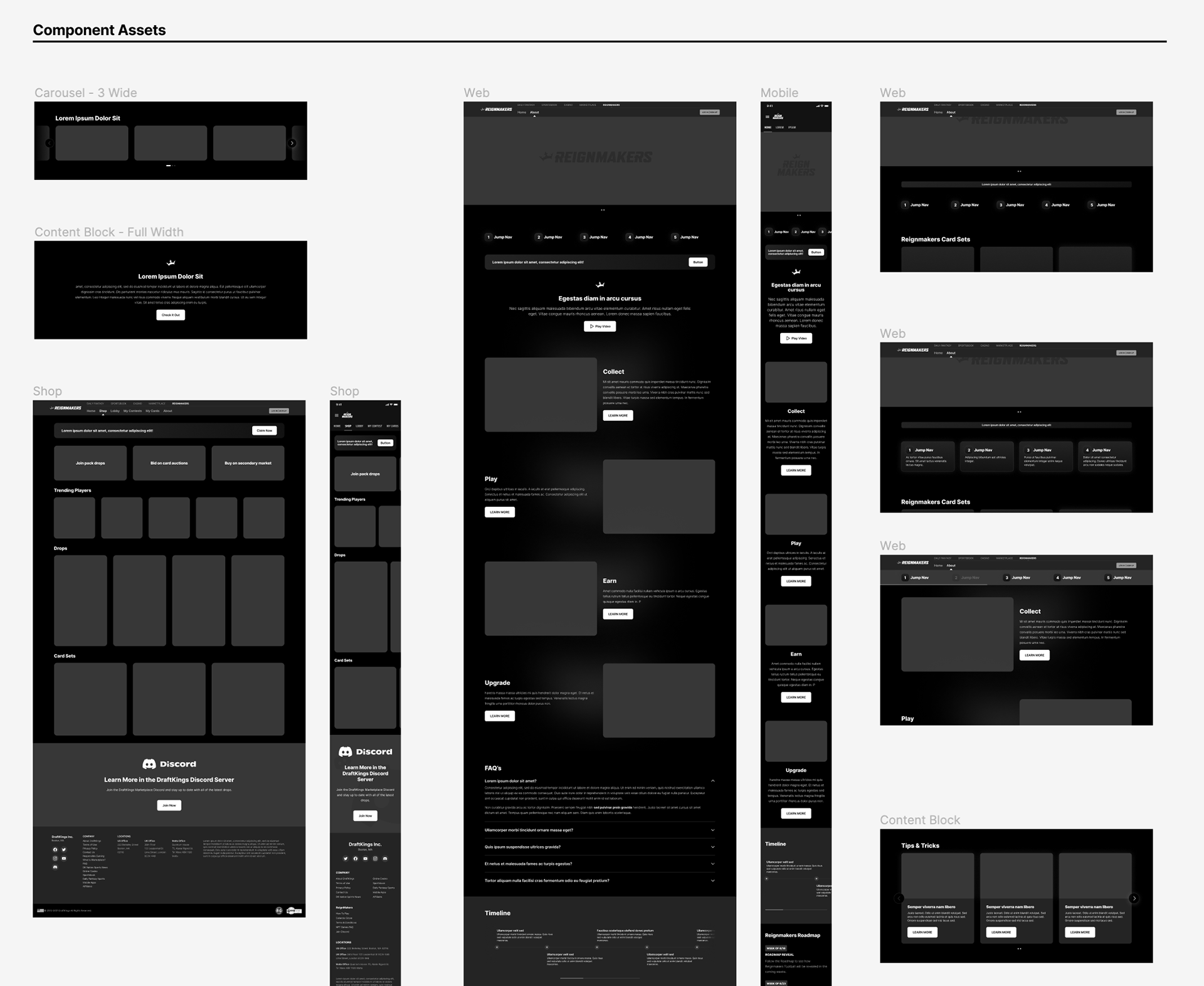
Resulting Revised "Content Stack" Design
Despite the constraint limiting custom components, the design stayed true to the spirit of the original design.
Component structure and typography changes were the most prevalent updates to be made. I worked closely with developers to redesign the components that were previously customized, checking in regularly to confirm that tweaks would not affect dev.
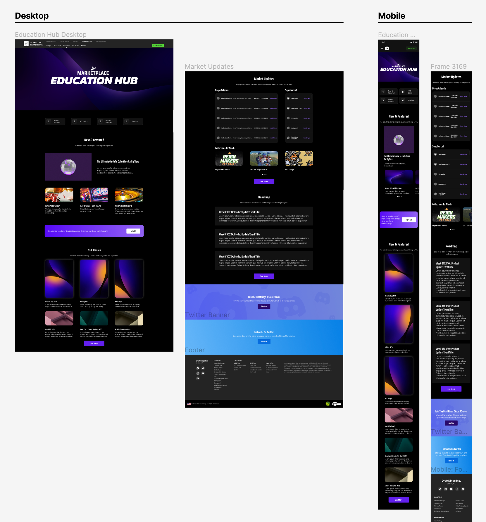
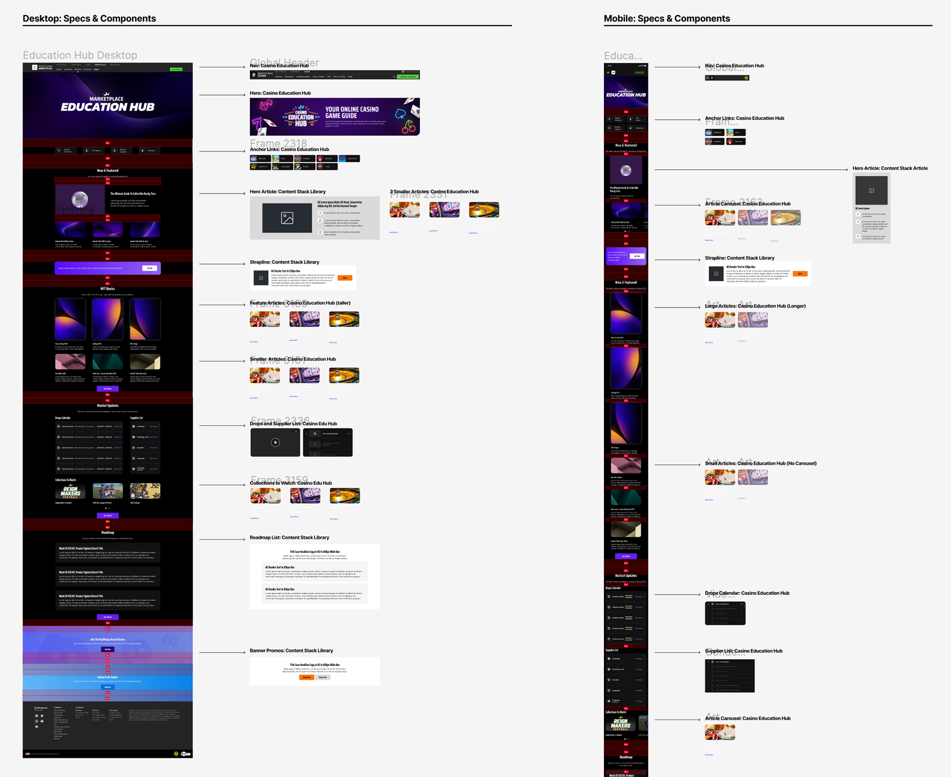
Providing Specs for Developers
In addition to using Figma's developer mode, I provided developers with spec documents calling out key details.
Within these documents, I made note of spacing, typography, and design system components used within the design. When needed, I called out where and how components were tweaked to assist in handoff.
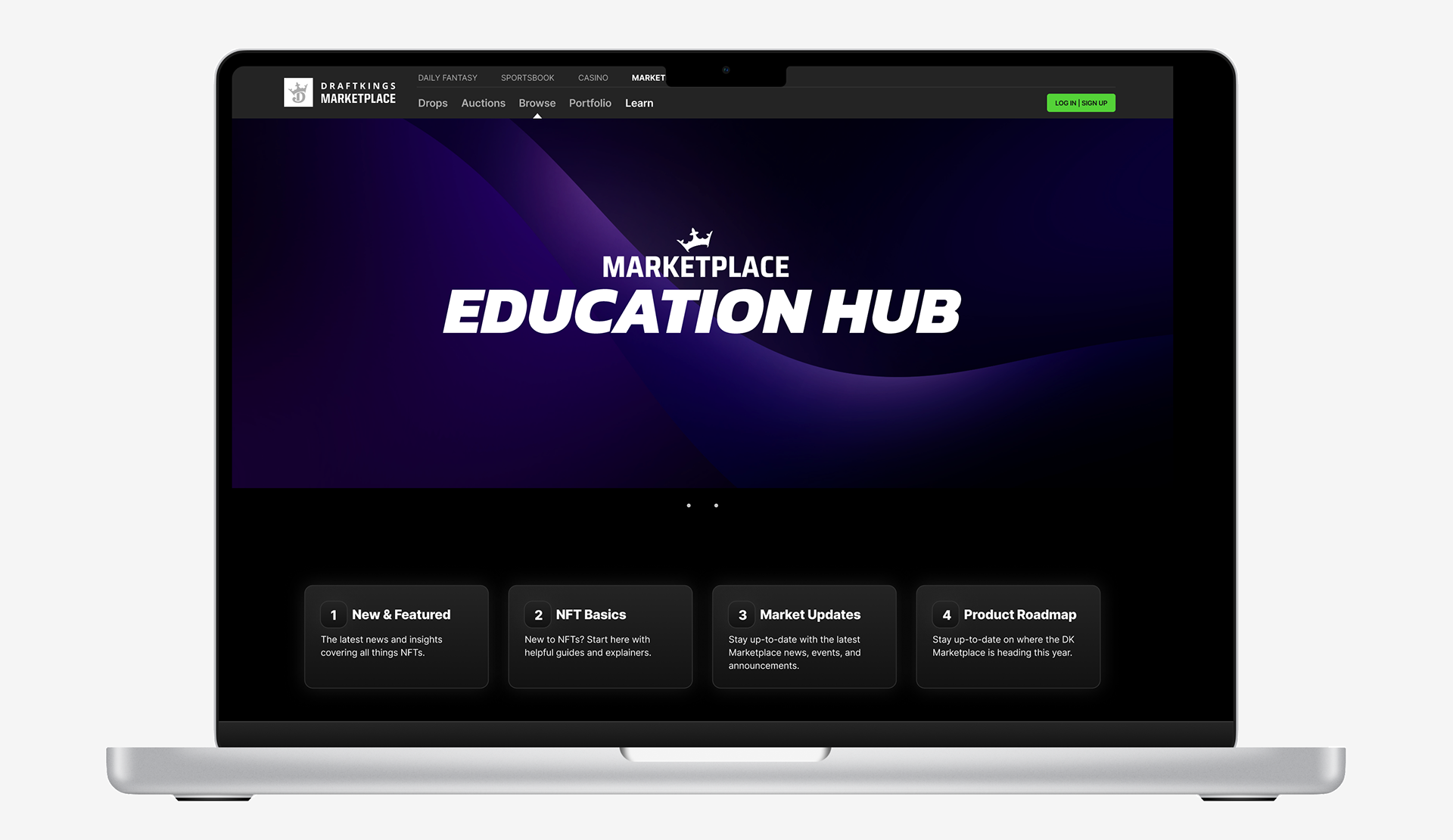
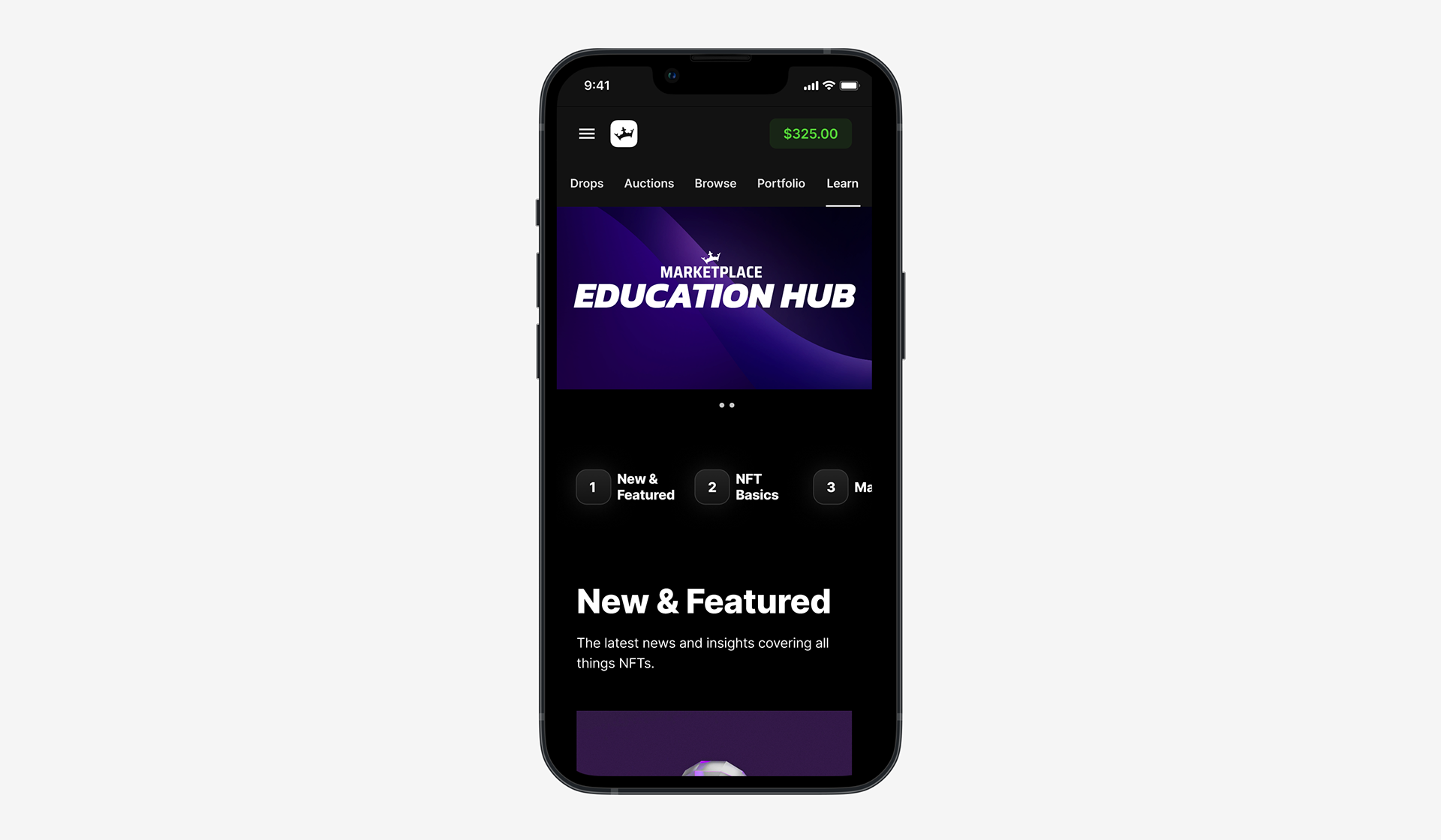
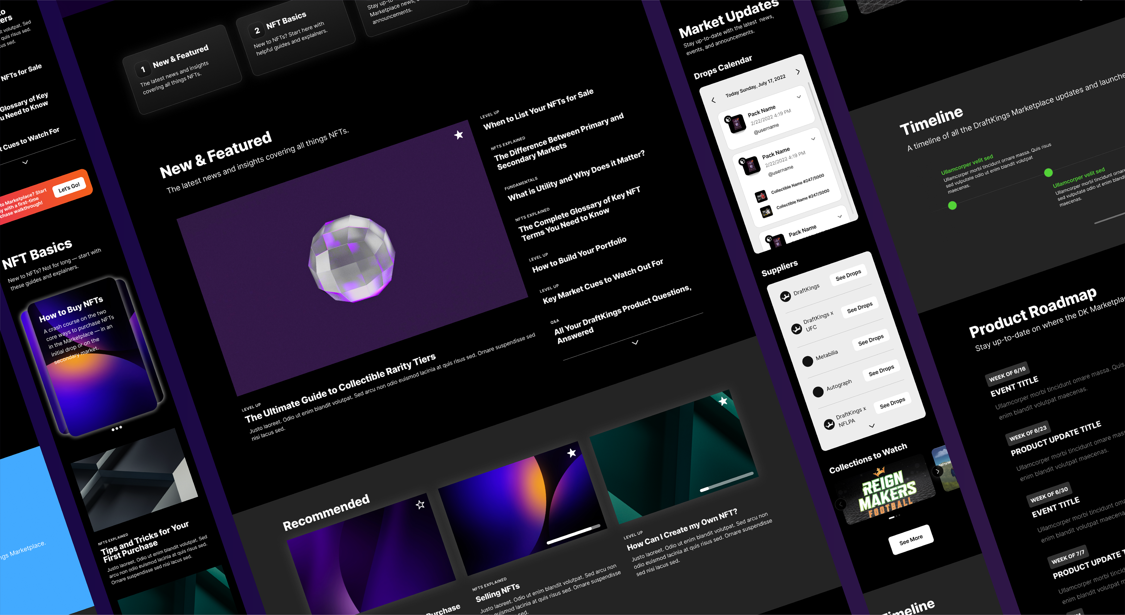
Final Design
Reflection
One of the most notable lessons stemmed from the necessity to adapt and pivot due to organizational constraints of time and financial resources.
Faced with the reality of these constraints, I had to be flexible in my design strategy and quickly translate my original vision into a more efficient component structure. Success in product design requires not only a keen eye for aesthetics but also a deep understanding of development constraints and business goals.
This project reinforced my philosophy of considering the entire end-to-end Product Design process — integrating various perspectives throughout, balancing stakeholder goals, and leaning on research to make informed design decisions.