
ONEHOPE Natural Teas Packaging Design
New branding and packaging design help ONEHOPE expand into the hot beverage market.
ONEHOPE has added a new line Natural Teas that will be featured within its curated gift sets alongside ONEHOPE wines, and outsourced food and lifestyle products. ONEHOPE is seeking branding for ONEHOPE Natural Teas that reflects that of the ONEHOPE master brand, while establishing a unique identity as a standalone product in the market.
ONEHOPE is a lifestyle brand with a world-class vineyard in the heart of Napa that gives back and creates a measurable impact through every product in our family of brands.
The Challenge:
How can we brand a new line of products that has a unique look and feel, but also stays consistent with the ONEHOPE brand and current products?
Skills
Branding
Graphic Design
Typography
Skills
Brand Identity
Packaging Design
Branding
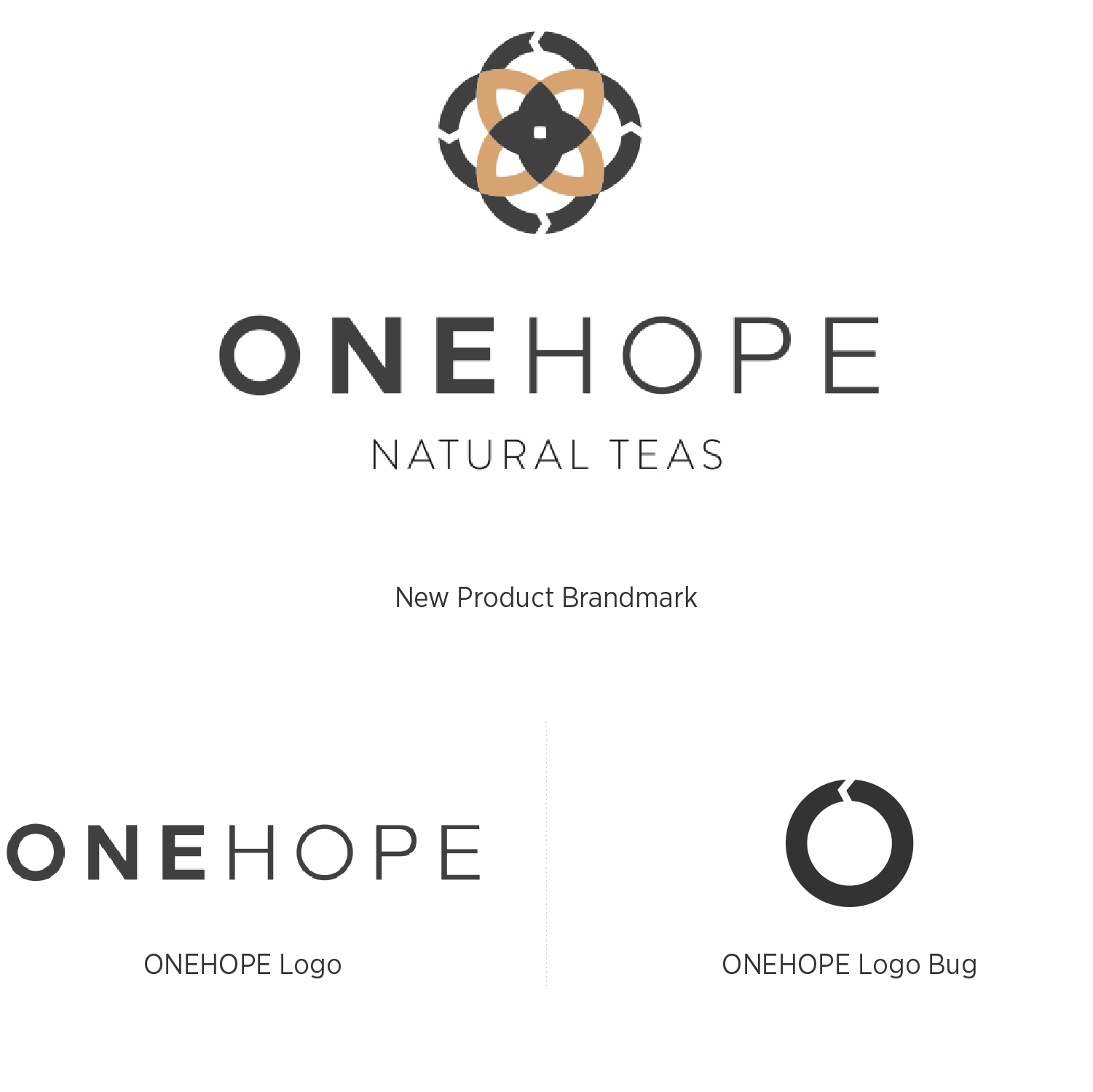
The line of teas features a new logo and logomark based off of ONEHOPE’s current logo.
The “synergy” logo bug used in ONEHOPE branding was re-imagined into a geometric, yet floral mark that reflects the natural element of tea beverages.
The new product brandmark incorporates the new logomark with the ONEHOPE logo to create an identity that is unique, yet consistent with current ONEHOPE Branding.
Packaging Design (Concept)
a cohesive, yet unique, style
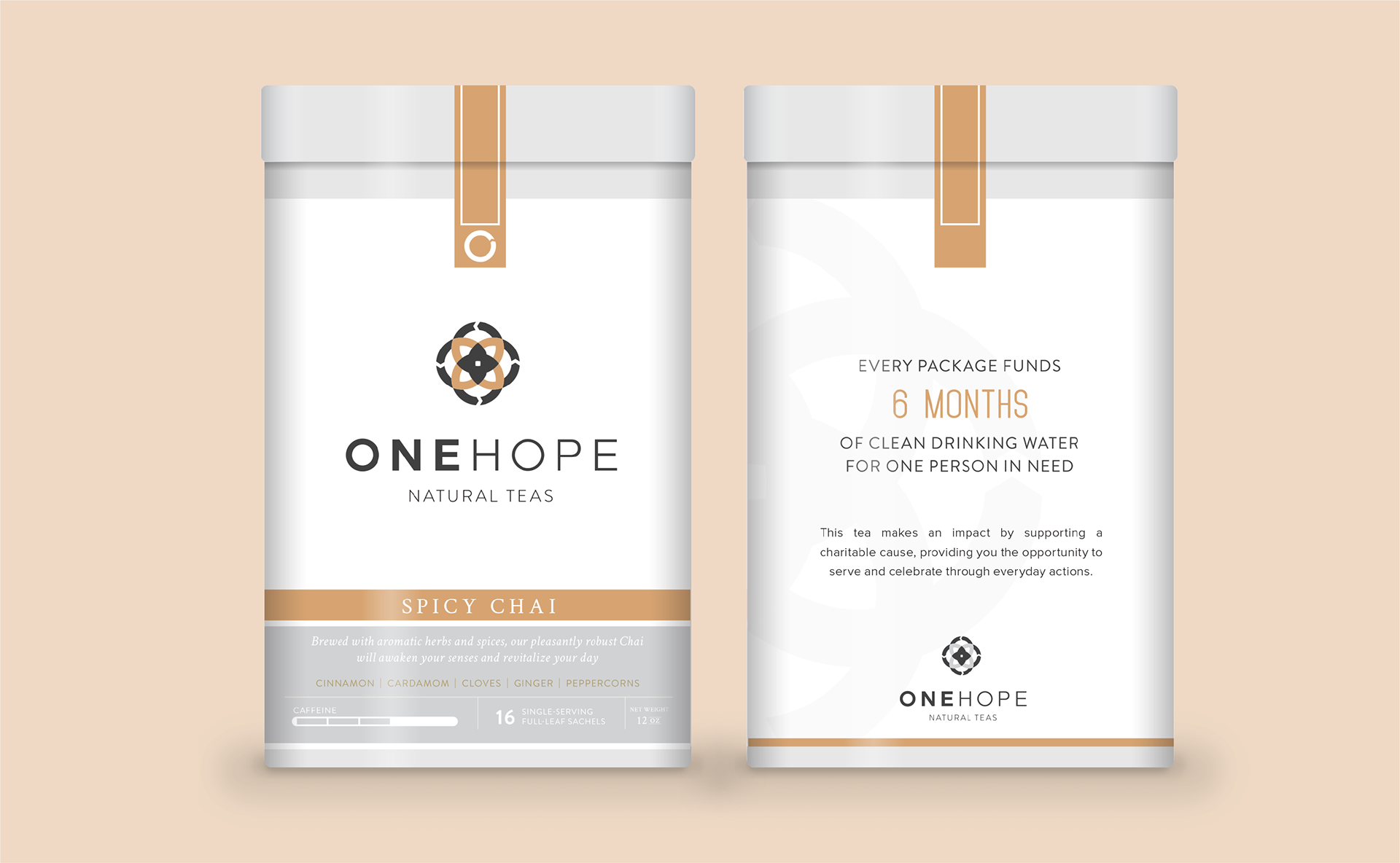
The packaging design for ONEHOPE Natural Teas is cohesive with the clean ONEHOPE aesthetic. The design’s use of bold color reflects that of ONEHOPE’s Core Collection of wines.
The designs feature printed front and back labels applied directly to a tin container. A label sticker that runs across the top of the slip lid keeps it closed and maintains the tea’s freshness.
product line branding
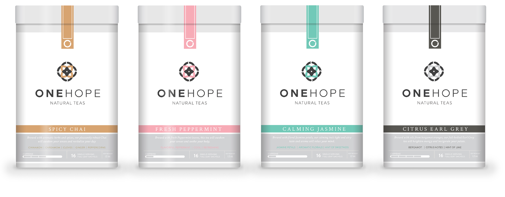
Each product in the complete product line features a different bold color that is reflective of the tea flavor. These colors hold a strong presence individually and complement each other when they are seen together as a cohesive product line.