
Thoughtful content and striking editorial design combine to establish an architecture firm as thought leaders in the industry.
Catalyst magazine was created to establish LPA as thought leaders in the Architecture/Engineering/Construction (AEC) industry. Through compelling imagery, engaging design, and valuable content, Catalyst engages the curious minds of executives, decision-makers, and influencers in the industry who are interested in the relationship between the built environment and the human experience.
The Challenge:
How can we use thoughtful content and striking editorial design to establish LPA as thought leaders in the industry?
Skills
Editorial Design
Multi-Page Print Production
Typography
Information Design
deliverables
Naming & Masthead Design
Editorial Design & Layout
Typography System
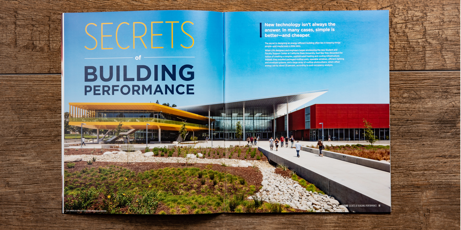
A Brand to Symbolize Forward-Thinking Innovation
Masthead and Logo Design
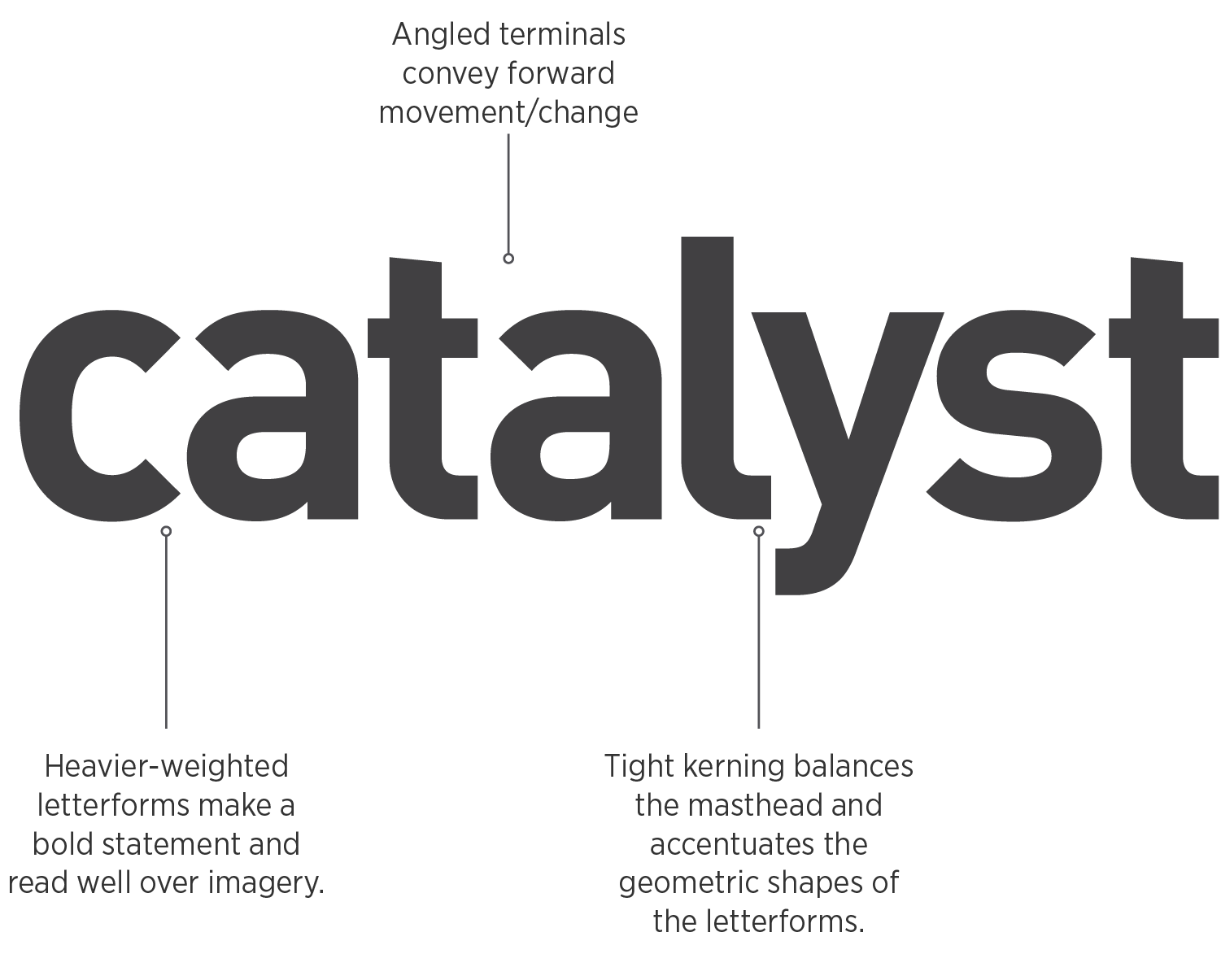
The Catalyst masthead is customized from the typeface DIN. Set in all lowercase, the masthead is approachable, well-balanced, and contemporary. The letterforms’ angled terminals reflect the idea of a catalyst’s spark.
This font is also used throughout the magazine as pull-quote type, and was so selected also for it’s complementary nature to Gotham and Gotham Narrow, LPA’s brand fonts.
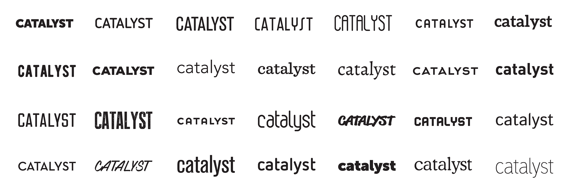
Magazine Naming
The design team went through an extensive exploratory process to determine the name of LPA’s new industry magazine. Based on the values of LPA and the goals of the magazine to establish the company as thought leaders in the industry, Catalyst was the perfect fit. The name reflects that the firm, and the stories and content that are shared within the magazines will be catalysts for innovative projects, engaging conversations, and positive change in the world through LPA’s sustainable design.
Masthead Typography Exploration
Typographic System
In addition to longer feature articles and Q&As, Catalyst provides a variety of article types which each relate to sections: Response, Insight, Spotlight, Feature, Research, LPAnews, and Forward Thinking.
Standing Sections
Each of these sections have a unique identity with typography and layout standards, based on the type of content that they feature, helping to differentiate their look and feel from other sections. However, each section follows a consistent typography treatment for the standing head in the upper left corner. The balance of consistency and individuality makes Catalyst engaging to read, issue after issue.
Headlines
Headline typography for opening spreads is when the full range of Gotham families, weights, and styles can be used — from Gotham Condensed Black to Gotham Thin Italic — as well as color. Typographic solutions connect the visual treatment of the headline to the content within the article.
Catalyst Issues 9-12 (2020)